
Tooltips are often used on the web to convey extra information about our content, such as displaying the meaning of an icon. Traditionally, these are often triggered on hover or focus leaving touch devices unsupported. When touch is supported, the implementation often relies on JavaScript adding to the complexity of the already tedious operation of positioning the tooltip.
Albeit not yet widely supported, we now have a much simpler way of implementing tooltip. By combining popovers with interest invokers we can create tooltips without the need for any JavaScript. Let's dive right in and see how it works.
Setup
The example presented in this article will use the following HTML (listing 1).
  <nav>
    <ul>
      <li>
        <a href="." class="nav-item">
          <span class="material-symbols">home</span>
        </a>
      </li>
      <li>
        <a href="." class="nav-item">
          <span class="material-symbols">settings</span>
        </a>
      </li>
      ...
    </ul>
  </nav>
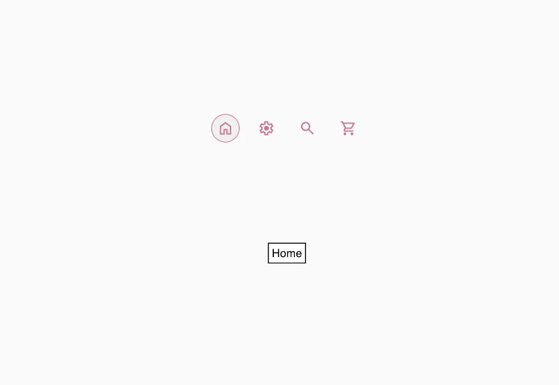
With some general theming applied our output looks as follows (figure 1):

Popover
Once we have created our nav, we are going to create our tooltip elements that will describe each of the icons. These are going to use the Popover API1, which allows us to create non-modal content that is displayed on the highest layer of the page (above other content). To define our tooltips as popovers, we will give them an attribute of popover with a state of hint.
popover="hint"Popovers can have states of auto, manual, or hint. If no state is provided, by default they are of type auto. The state defines its behavior when the user clicks outside of the popover (also referred to as 'light dismissed') and in relation to other popovers. The following table breaks down how each state behaves.
| Behavior | auto | manual | hint |
|---|---|---|---|
| Light Dismiss | yes | no | yes |
| Only 1 at a time | yes* | no | yes** |
Dismissible using browser-specific mechanism (ex: Esc) | yes | no | yes |
* The exception being for nested popovers
** Will close other hint popovers but not auto popovers allowing us to show the hint without closing other popovers such as warning or toasts that may be present in the UI.
With the added popovers defined, our HTML looks as follows (listing 2):
  <nav>...</nav>

  <div class="tooltip" id="callout-home" popover="hint">Home</div>
  <div class="tooltip" id="callout-settings" popover="hint">Settings</div>
  ...
Notice that in addition to popover="hint" we have also given each tooltip an id. We will use this to tie the individual links in our nav back to their respective tooltips.
Interest Invoker
Now that the tooltips are defined, we are going to use the Interest Invoker2 to trigger showing and hiding the tooltip. The Interest Invoker allows us to trigger when the user expresses or loses interest in an element in an accessible way without the use of JavaScript. "Showing interest" is generally defined by the hovering, focusing, or (in the case of touch devices) long-pressing on the element.
interestforIn terms of code, this means that we give the element that needs a tooltip the interestfor attribute, with a value of the id of the popover to be displayed when the user "expresses interest" in the element. Our updated HTML therefore looks as follows (listing 3).
    <nav>
      <ul>
        <li>
          <a href="." class="nav-item" interestfor="callout-home">
            <span class="material-symbols">home</span>
          </a>
        </li>
        <li>
          <a href="." class="nav-item" interestfor="callout-settings">
            <span class="material-symbols">settings</span>
          </a>
        </li>
        ...
      </ul>
    </nav>

    <div class="tooltip" id="callout-home" popover="hint">Home</div>
    <div class="tooltip" id="callout-settings" popover="hint">Settings</div>
    ...
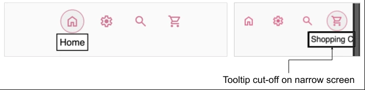
When interacting with our nav items, the popover now displays however, it is not positioned with our element (figure 2).
Next we are going to use CSS to both style and position the tool tip under its triggering nav item.
Positioning and styling the tooltip
First we are going to position the tooltip under the correct nav item. To achieve this we need to give it a position of absolute, then we are going to define the anchor (the triggering element). To do this, we use the position-anchor property3. We can either define each pair using a dashed-indent to explicitly tie each nav item back to each popover, or use the auto keyword which will associate the popup back to it's implicit anchor element. Since we already have nav item referencing the tooltip by id, we can use auto in this case.
We must also define where in relation to the anchor the popover needs to be placed using the position-area property4. We are going to place the tooltip underneath the nav item, so we will choose bottom. Our CSS to position our tooltip will therefore be as seen in listing 4.
  .tooltip {
    position: absolute;
    position-anchor: auto;
    position-area: bottom;
  }
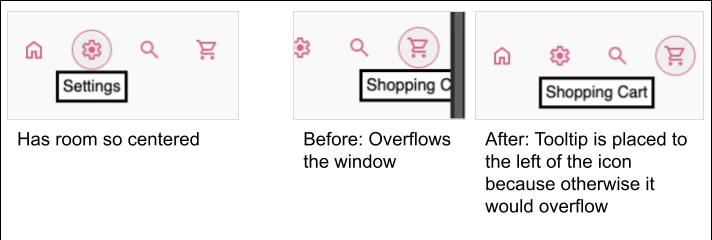
With the CSS applied (figure 3), our tooltip is now correctly positioned, however if we narrow the window and we notice that the text will overflow off screen.
To make sure that regardless of where our nav item is on the screen, the tooltip does not overflow, we can add fallbacks using the position-try property5. This is a shorthand property that allows us to define both the fallback options and the order in which they should be tried in the event the content in the popover overflows its containing block. We therefore edit our CSS as follows:
  .tooltip {
    position: absolute;
    position-anchor: auto;
    position-area: bottom;
    /* Added fallbacks */
    position-try:
      bottom,
      bottom right,
      bottom left,
      top,
      top right,
      top left;
  }
With our positioning and overflow handled (figure 4) we can finish styling the tooltip by adding the following to our tooltip class (listing 6).
  .tooltip {
    ...
    border: none;
    top: 2px;
    background: rgba(0,0,0,.56);
    color: white;
    font-size: .7rem;
    border-radius: 12px;
    padding: 4px 12px;
  }
With these last couple of adjustments we now have beautiful tooltips, that are accessible and mobile friendly without the use of JavaScript.
See the Pen Interest Invokers by Martine Dowden (@martine-dowden) on CodePen.
Happy Coding!