One of the reasons I end up pulling in a UI library to my projects is often dialogs. They were always, not really a mystery, but something I really didn't think about much and just accepted as probably really hard to implement. Turns out, there are elements and methods right there in HTML, CSS, and JavaScript already there and ready for us to use. So let's take a look at how we would create and style a dialog without the use of a library.
Functionality
The contents of our dialog are going to go into a <dialog> element. By using this element, rather then a <div>, we gain access to a lot of built in functionality and accessibility features already baked in for us. Some of these features are the open attribute and some default styles. Let's create our dialog and a button that we will use to open it (Listing 1).
<div class="actions">
  <button type="button" id="openDialogButton">Click Me</button>
</div>

<dialog id="myDialog">
  <header>
    <h2>Coffee</h2>
  </header>
  <section class="body">
    <p>Coffee, the world's favorite beverage...</p>
    <p>Coffee is more than a drink...</p>
  </section>
  <footer class="actions">
    <button type="button" id="closeDialogButton">Close</button>
  </footer>
</dialog>
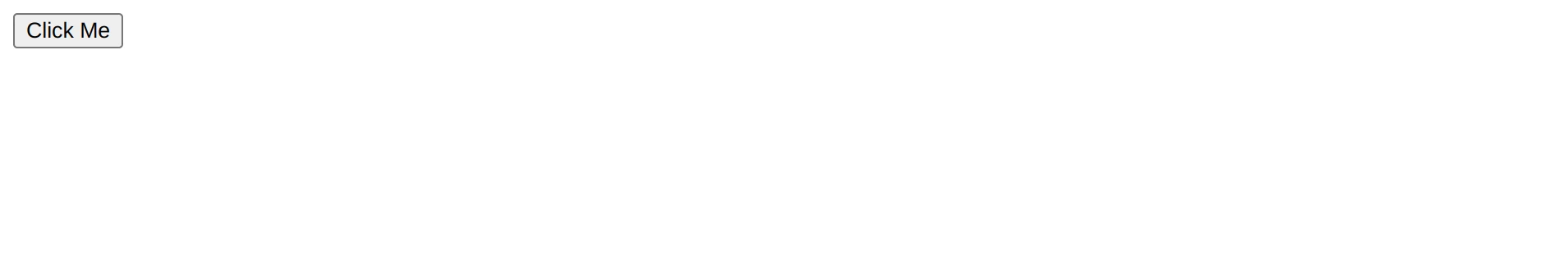
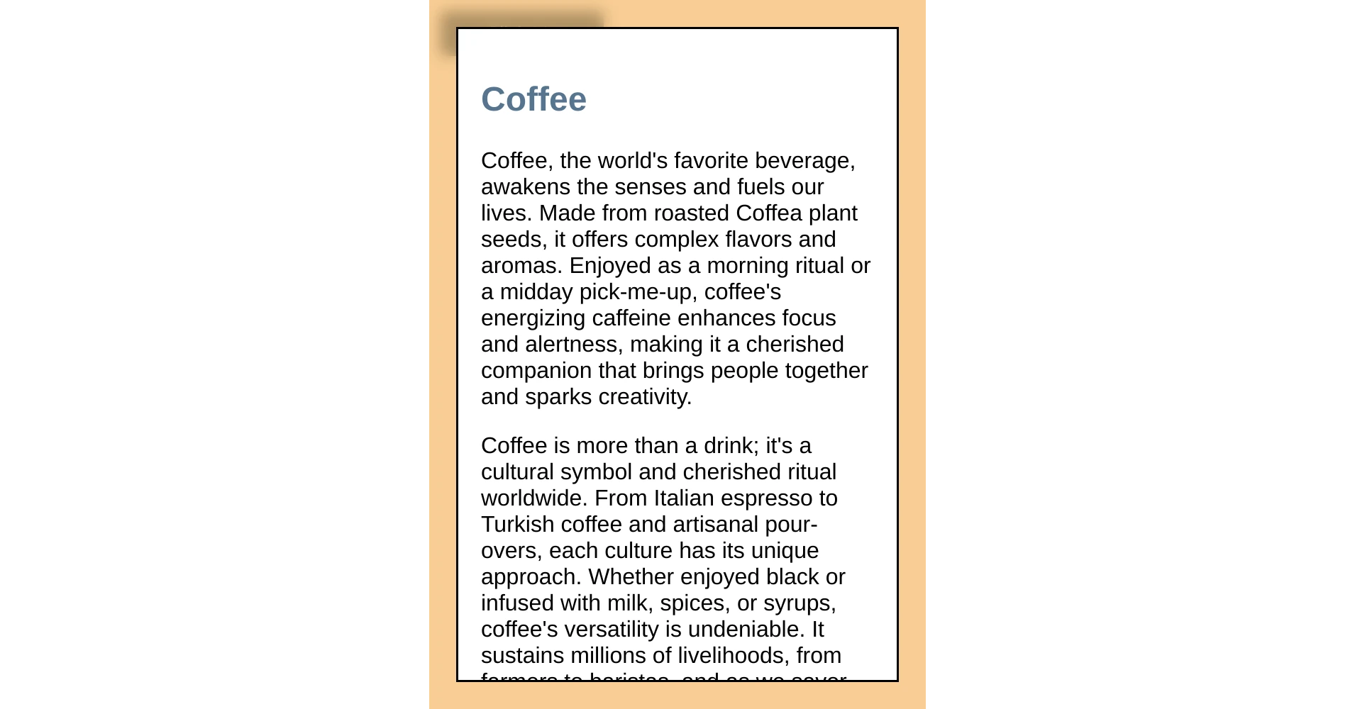
Notice in figure 1 that when we run this code, all we see is the button. The dialog is closed by default.
Next let's add the JavaScript so that we can open and close our dialog (listing 2).
//  On load
(() => {
  'use strict'

  //  The dialog
  const myDialog = document.getElementById('myDialog')

  //  Open and close buttons
  const openDialogButton = document.getElementById('openDialogButton')
  const closeDialogButton = document.getElementById('closeDialogButton')


  //  On click event listener that opens the dialog
  openDialogButton.addEventListener('click', () => {
    //  open the dialog
    myDialog.showModal()
    //  put the focus on the close button
    closeDialogButton.focus()
  })

  //  On click event listener that closes the dialog
  closeDialogButton.addEventListener('click', () => {
    //  close the dialog
    myDialog.close()
  })
})()
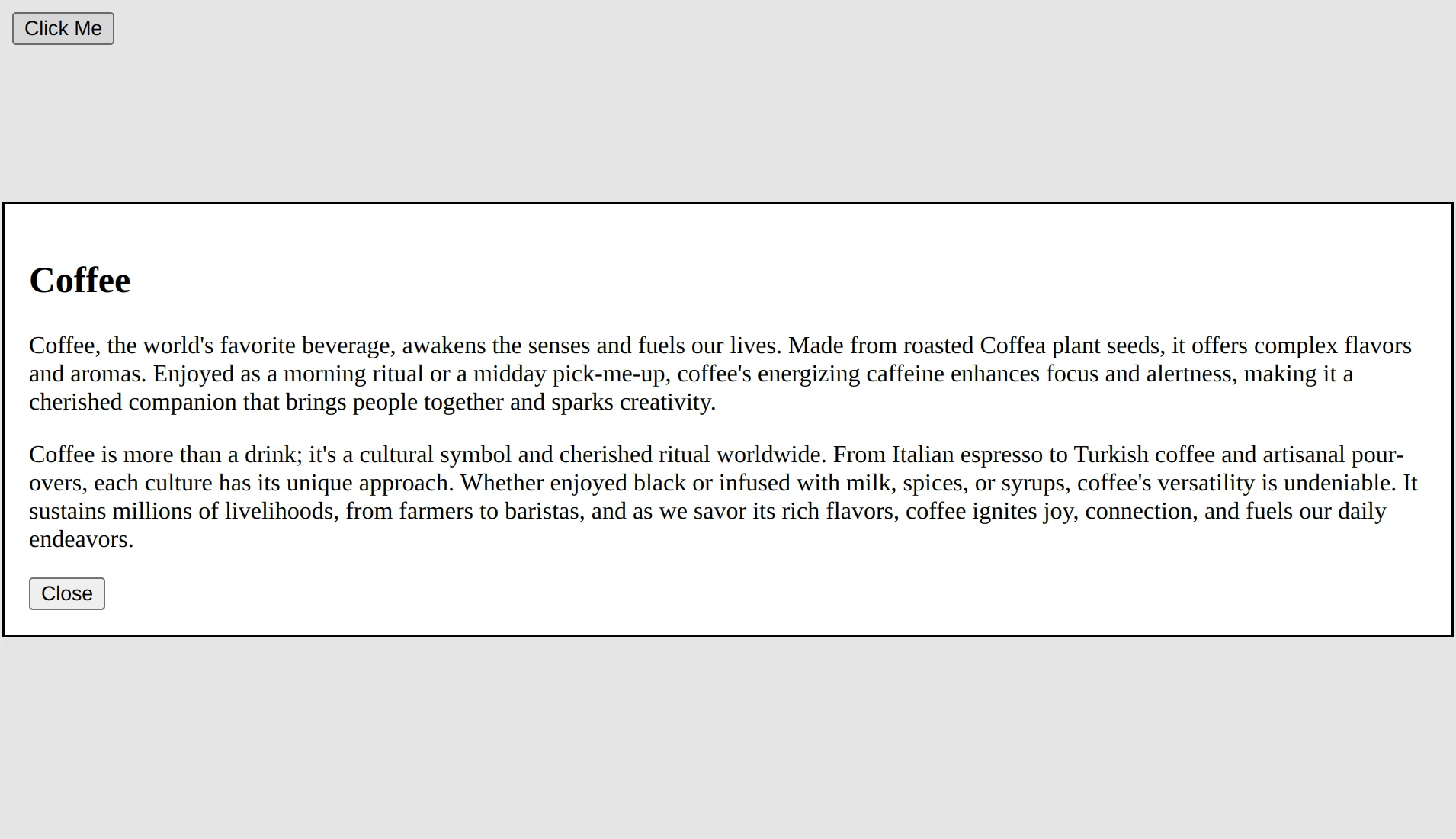
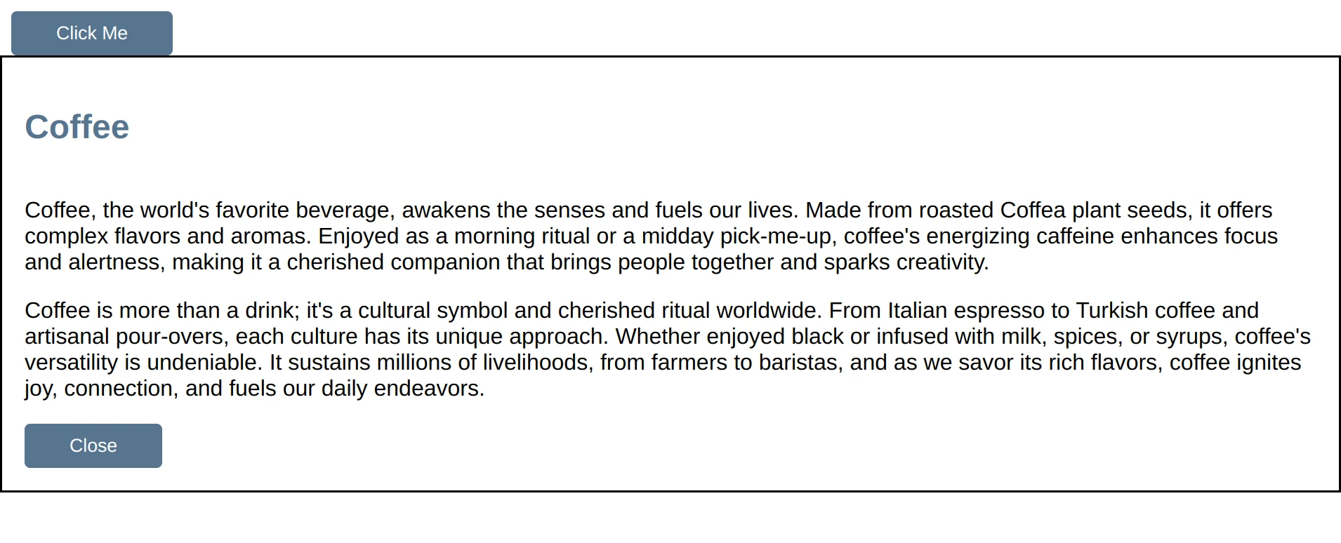
The showDialog() and close() methods are part of the HTMLDialogElement interface which is used by the <dialog> element. showDialog() displays the dialog on the top layer and includes a backdrop that we can style using the ::backdrop pseudo-element (more on that a little bit later in this article). close() as its name implies, closes the dialog. Figure 2 shows our open dialog.
Note: Notice that pressing the escape key also closes the dialog even though we didn't have to write any code for that. One of the many benefits of using semantic tags is that they come along with baked-in behaviors; this is one of them for dialogs.
We now have a mechanism to open and close our dialog, which means we can see it and start to style it.
Styles
Let's start by setting some custom properties for our theme colors and styling our typography and buttons. Next we will style the dialog and backdrop itself. Listing 3 shows our theme styles.
/* Theme colors applied to root */
:root {
  --primary: #577590;
  --primary-contrast: white;
  --accent: #F08A4B;
  --backdrop: rgba(242, 165, 65, .56);
  --text: #1a252f;
}

/*
  Change box model behavior from content-box to border-box
  When padding is added the content area shrinks
  rather than size of the element increasing.
*/
* { box-sizing: border-box }

html {
  margin: 0;
  padding: 0;
}

body {
  font-family: sans-serif;
  color: var(--text);
}

:where(h1, h2, h3, h4, h5, h6) { color: var(--primary) }

button {
  background: var(--primary);
  color: var(--primary-contrast);
  border: none;
  padding: .5rem 2rem;
  border-radius: 4px;
}
button:where(:focus, :focus-visible) {
  outline-offset: 2px;
  outline-color: var(--accent);
}
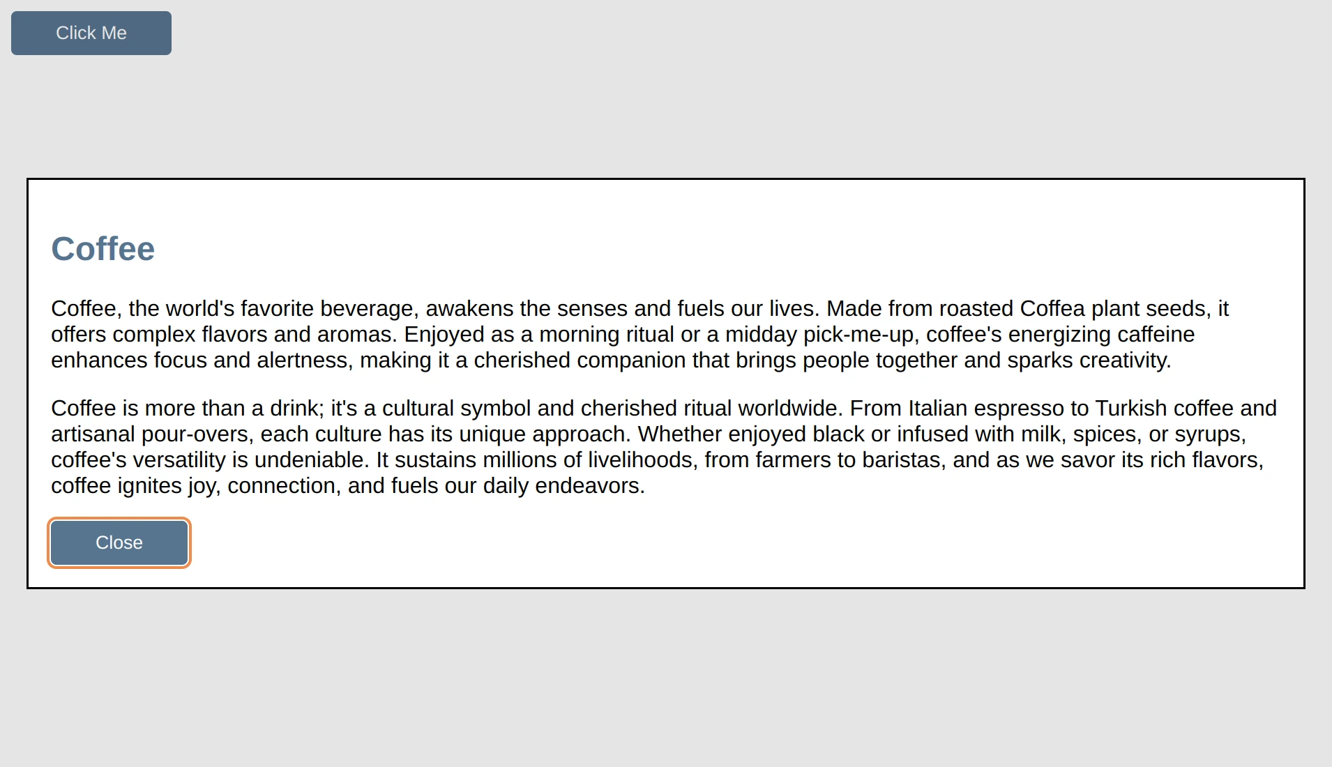
Our page now looks as seen in figure 3.
With the general theme out of the way, let's focus on styling the actual dialog elements starting with the backdrop.
The backdrop does not inherit from anything, we therefore must add it as a selector to our rule that contains all of our custom properties if we want to be able to use them on our backdrop (listing 4).
:root
::backdrop { /* <-- adding backdrop to our selectors */
  --primary: #577590;
  --primary-contrast: white;
  --accent: #F08A4B;
  --backdrop: rgba(242, 165, 65, .56);
  --text: #1a252f;
}
Now that we can use our custom properties on the backdrop, let's go ahead and change its background color to use the --backdrop custom property and give it a bit of a blur as seen in listing 5.
dialog::backdrop {
  background: var(--backdrop);
  backdrop-filter: blur(5px);
}
With the backdrop styled (figure 4), let's focus on the dialog itself.
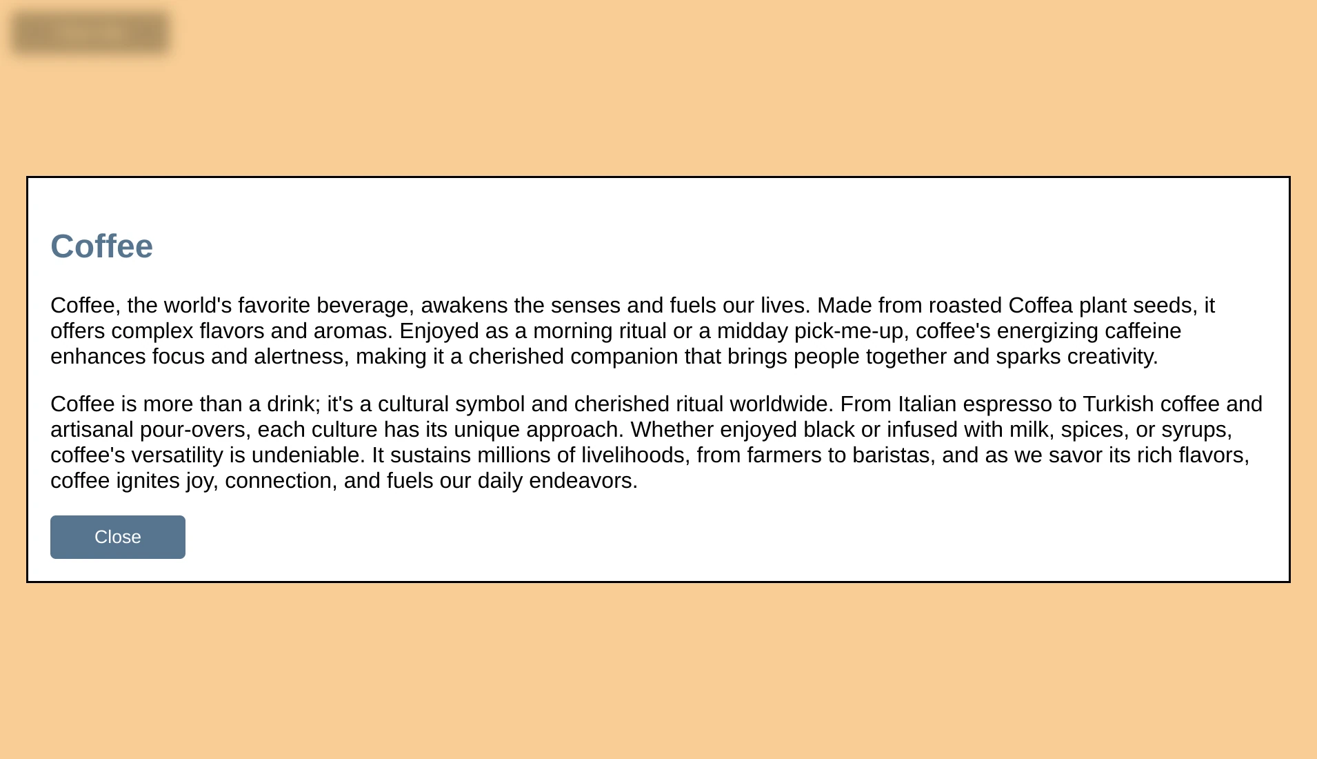
Let's make it so that when our dialog content is larger than our screen (figure 5), instead of the entire dialog contents scrolling, we keep our header and footer visible and only scroll the body section. To do this we will use grid.
We can't just give our dialog a display of grid because otherwise, when it is suppose to be closed it becomes visible on the screen (figure 6). We can only change the display property value of the dialog when it is open.
We therefore use a selector attribute: dialog[open]. When the dialog is open, the browser automatically gives it an attribute of open and then removes it once closed. We can therefore use this attribute in our selector, to only change the display property value when the dialog is open. Our CSS therefore looks as follows (listing 6).
dialog[open] {
  display: grid;
  grid-template-rows: min-content auto min-content;
  width: 75svw;
  height: 75svh;
}
dialog section.body { overflow-y: auto }
By setting the width and the height, and then giving the body section a vertical overflow of auto, the header and footer now stay in view but the center section scrolls (figure 7).
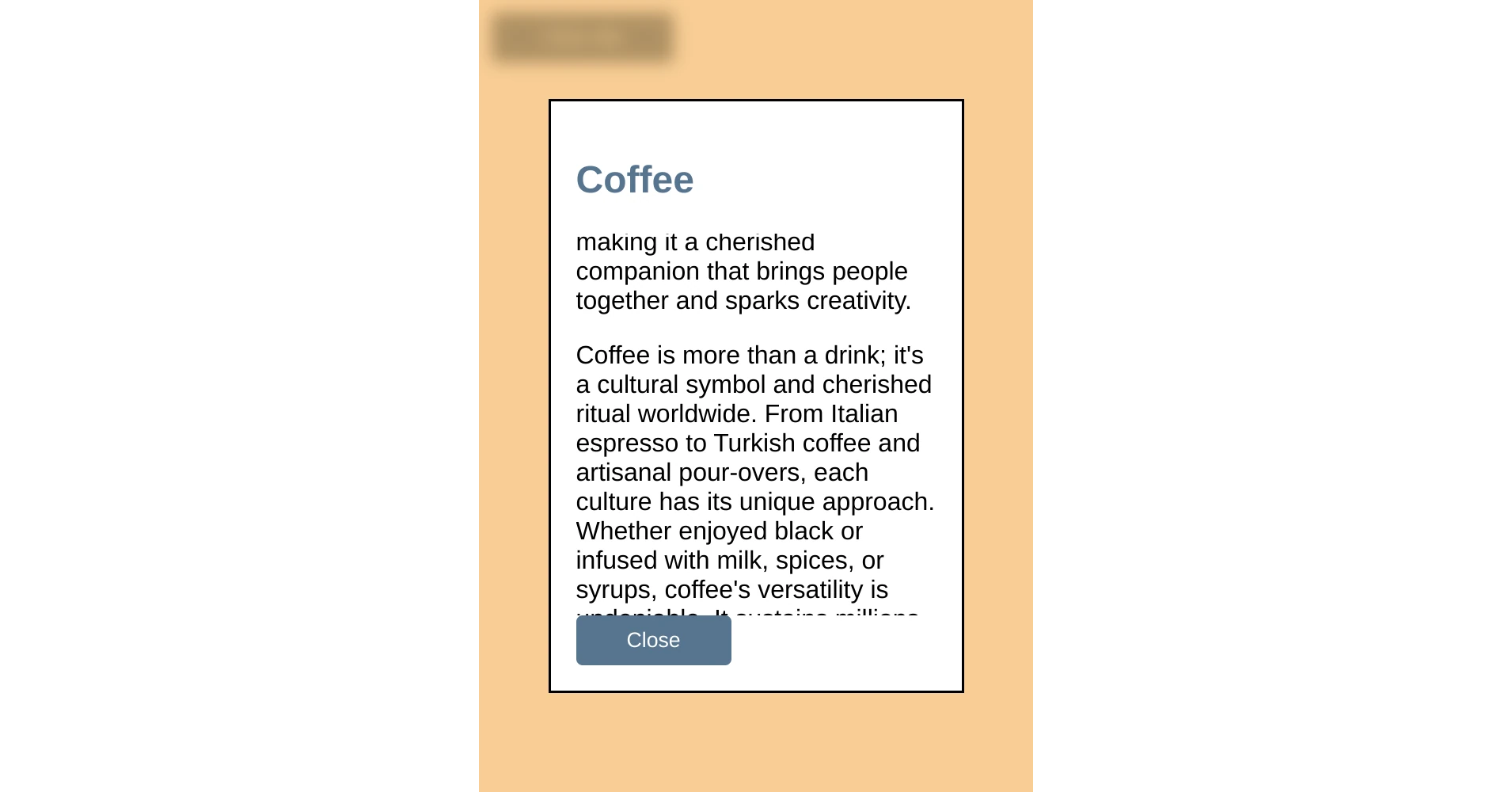
However, our scroll-bar is inset due to the default padding the browser gives the dialog. The sections also blend into each other a bit so let's adjust the padding and add a little bit of polish to it's contents.
To make it more obvious that this is a dialog, we are also going to replace the border with a drop shadow so that it seems like it is floating above the backdrop.
Listing 7 shows our finishing touches.
dialog[open] {
  display: grid;
  grid-template-rows: min-content auto min-content;
  width: 75svw;
  height: 75svh;

  padding: 0;
  border: none;
  border-radius: 4px;
  box-shadow: 0 0 10px var(--primary);
}
dialog > header {
  padding: .5rem 1rem;
  background: var(--primary);
  color: var(--primary-contrast);
  box-shadow: 2px 0 2px var(--primary)
}
dialog > header > h2 {
  color: inherit;
  margin: 0;
}
dialog section.body {
  overflow-y: auto;
  padding-left: 1rem;
  padding-right: 1rem;
}
dialog > footer {
  padding: .5rem 1rem;
  box-shadow: -2px 0 2px var(--primary);
  display: flex;
  justify-content: flex-end;
}
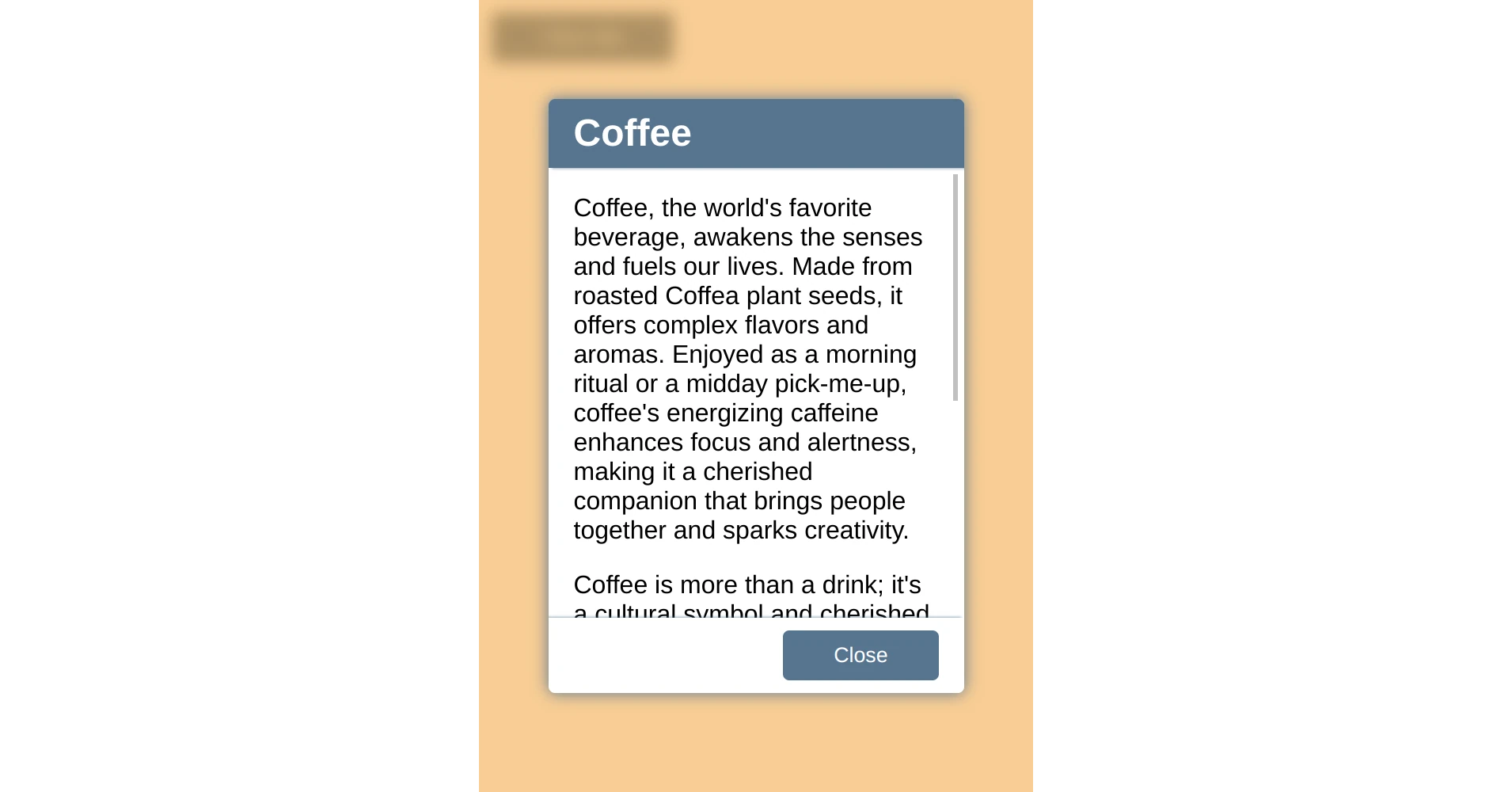
Our finished dialog looks as seen in figure 8. By giving the header a background color and adding shadows to the header and footer, the content portion of the dialog becomes more distinct. The scroll bar is also now better positioned at the edge of the dialog. Finally the shadow given to the dialog itself creates a cense of depth to the design.
And just like that we have a functioning, styled dialog and we were able to do it using functionality already available in HTML, CSS, and JavaScript.
You can find a running version of the code presented on codepen at https://codepen.io/martine-dowden/pen/BaGLeJW.
Happy Coding!