
Page and section headers are one of the first thing readers notice while looking at a web page. Often styled to be larger, bolder, and visually distinct from the rest of the content, they help us process and understand the content being presented.
Because they are front and center, taking care to style them in ways that are visually appealing is a common task performed by designers and developers. If online content was always presented in standardized window sizes, preventing the text from wrapping in undesirable ways would be easy. However, the reality is that we need to make our content work for an almost infinite number of viewport sizes.
Having reached baseline capability in March of 2024, we can now use the text-wrap property to affect how our text gets applied.
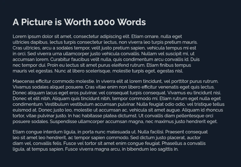
text-wrap: wrap
By default, the text-wrap property has a value of wrap which optimizes for as little overflow as possible. From a practical standpoint, the user agent puts as many words as it can on each line before moving onto the next as seen in figure 1.
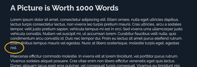
text-wrap: wrapBecause text-wrap: wrap is optimized for efficiency, it does not take into consideration the length of the paragraph which can lead to orphans. Because orphans can decrease the readability of large blocks of text, and in the context of headers can be unsightly, it is desirable to try and avoid them.
Let's look at the different values which can be assigned to text-wrap to see how they alter how our text is displayed.
text-wrap: nowrap
If we change the text-wrap property value applied to the paragraphs from its default value of wrap to a value of nowrap, we can prevent the lines from wrapping at all. In figure 2, we see the paragraphs now staying on their individual lines and overflowing their container outlined using yellow dots.

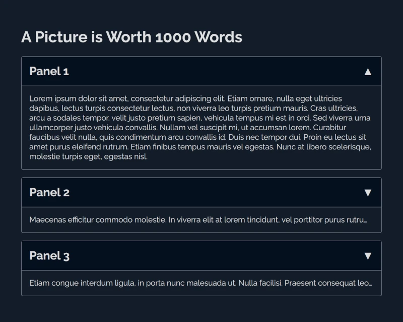
text-wrap: nowrapAlthough not helpful for our current use case, preventing certain elements from wrapping can come in handy when showing only a small percentage of the text with some other way of accessing the full content such as in expandable panels.
In listing 1, we use text-wrap: nowrap in conjunction with the overflow and text-overflow properties to hide the overflowing text, add ellipses at the end of the line to show that there is more text available than what is being displayed, and achieve the panels found in figure 3.
section.closed p {
  text-wrap: nowrap;
  text-overflow: ellipsis;
  overflow: hidden;
}
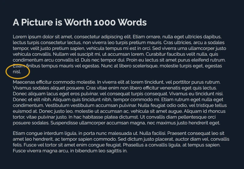
text-wrap: nowrap with ellipsesGoing back to our original layout, we still haven't addressed our orphan issue (figure 4).
text-wrap: balance
One of the recently added property values we can use to alter how text is painted is balance. Now available across all major browsers (figure 5) it tries to balance the number of characters found in each line.

text-wrap: balanceWhen giving our paragraphs' text-wrap property a value of balance and viewing the output in Chrome (figure 6), we notice a little bit of a difference in the third paragraph, but none on our first one, which is the one with the orphan.
Comparatively, when viewing our results in Firefox, we see that our first paragraph orphan is no longer present (figure 7).
Both Chrome and Firefox have text-wrap: balance implemented, however they differ in their application. For performance reasons browsers limit the number of lines they will balance characters over. Chrome's limit is 6 or less lines, while Firefox's is 10.
Due to this limitation, text-wrap: balance will not work for large bodies of text and is much better suited for headers or short content such as on the tile of the example shown in figure 8.
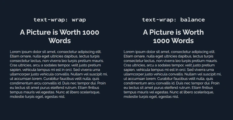
wrap (left) versus balance (right) applied to the page's titleSince text-wrap: balance does not work well for large bodies of text, we need to look for a different solution for our content.
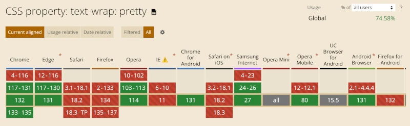
text-wrap: pretty
A better option for handling orphans in large bodies of text like our paragraphs is text-wrap: pretty. Unfortunately the property is currently (January 2025) not yet well supported (figure 9).
text-wrap: pretty on January 23, 2025Like wrap, when using a value of pretty, the algorithm used is optimized for minimizing overflow therefore putting as many words as it can on a line before moving onto the next. However, when using pretty the user agent prioritizes layout over speed which helps minimize the number of orphans.
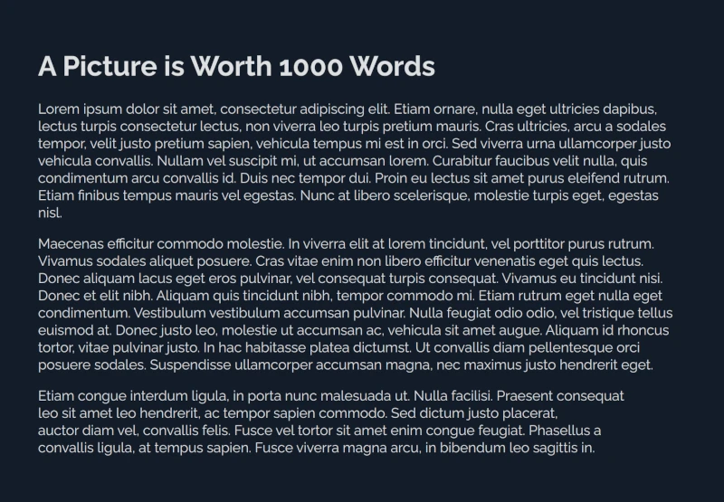
Figure 10 shows our original layout in Chrome with text-wrap: pretty applied to the paragraphs and our first paragraph finally no longer ending in an orphaned word.
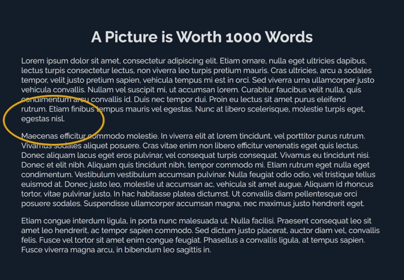
text-wrap: prettyNow you know how to use text-wrap to create more aesthetic paragraphs and titles, reducing orphans, and improving readability without sacrificing on a fluid or responsive layout.
Happy Coding!