A little bit of history
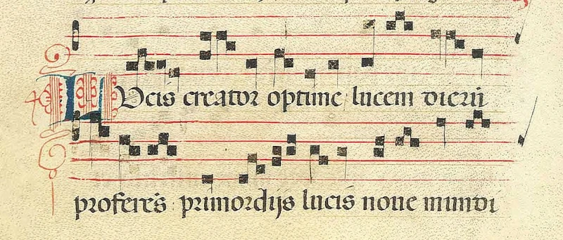
Drop caps have been around for for centuries. Even before we had CSS, or computers, or even the printing press. They were already around when monks were painstakingly copying books by hand in their monasteries. Often full of intricate details they usually marked the beginning of chapters or paragraphs to indicate the beginning of a new sections or chapters. An example of a drop cap is shown in figure 1.
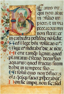
Once we started using the printing press, the presence and drop caps diminished along with their complexity (figure 2) although when used, their purpose stayed the same, to denote the beginning of a paragraph or chapter.
Drop caps on the web
Then came the web, and drop caps became a lot more difficult to implement. Although we have had the ::first-letter pseudo-element, which allows us to select the first letter in any given element, aligning the letter to the rest of the text could be a bit tricky. One solution was to use a combination of floats and margins. First, we select the first letter of the first paragraph and set the color and font size as seen in listing 1.
p:first-of-type::first-letter {
  color: var(--accent);
  font-size: 350%;
}
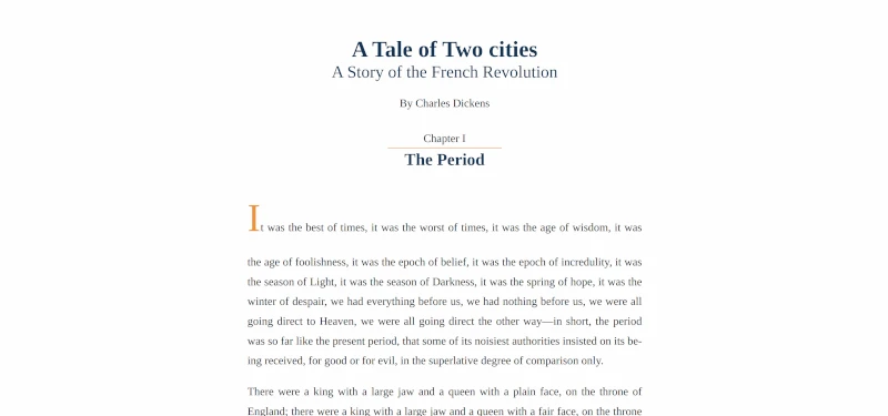
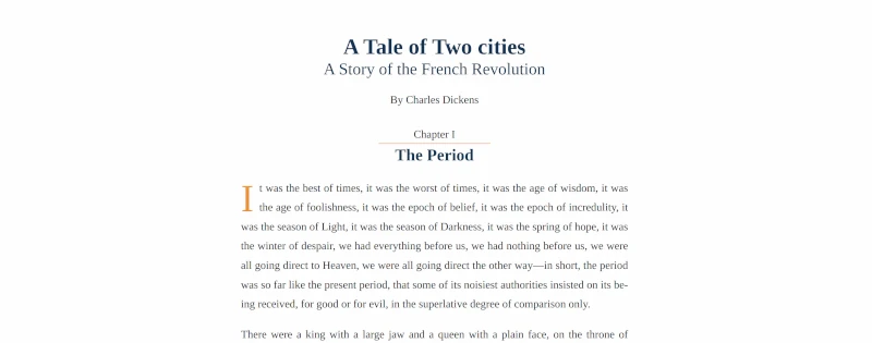
Because we increase the size of the letter, the letter towers above the text as the baseline of the letter is the same as the rest of the line, as seen in figure 3.
To be able to manipulate the letter's position, we then float the letter to the left and use line-height and margins to vertically align the top of the letter to the top of the rest of the line (listing 2), which produces the output seen in figure 4.
p:first-of-type::first-letter {
  color: var(--accent);
  font-size: 350%;

  float: left;
  line-height: .25;
  margin-right: .5rem;
  margin-top: .4em;
}
But what if we had a simpler way of achieving the same result?
The initial-letter property
Recently introduced is the initial-letter property, which allows us to position the letter without having to float it or calculate margins and line-heights to position it.
As of October 2023, the support is still a bit shaky (figure 5), but even with only partial support we can already see the benefits and ease of use.
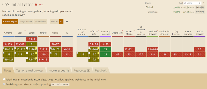
initial-letter browser support on October 25th 2023Note: To check the current state of browser support for initial-letter, visit Can I use initial-letter?
The initial-letter property takes 2 numbers.
The first is the number of lines the letter is going to span. In other words, how tall our letter is going to be in terms of paragraph lines. We want ours to span two lines, so we will use a value of 2.
The second is optional and is how many lines we want our letter to sink into the text by. We want ours to be flush with the top of the first line, we set it to be 2 lines tall, so we will also make it sink by two lines.
Our declaration therefore looks as follows: initial-letter: 2 2;.
Using this property we can therefore radically simplify our CSS (listing 3).
Note: ::first-letter and initial-letter will often be used together but have very distinct functionality. ::first-letter is a pseudo-element and allows us to select the letter, while initial-letter is a property and allows us to style it.
  p:nth-of-type(2)::first-letter {
    color: var(--accent);
    margin-right: .5rem;

    -webkit-initial-letter: 2 2;
    initial-letter: 2 2;
  }
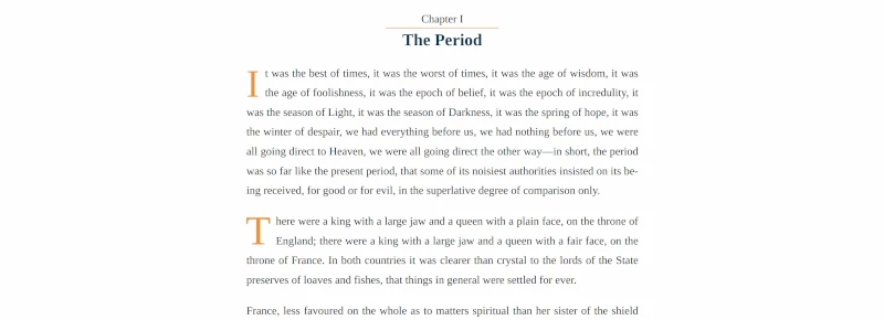
Same as before, we need to keep the color change. We also keep the right margin, which adds a little bit of horizontal space between the letter and the rest of the text. But now, all of the positions previously being done via the float, top-margin, and line height are handled by the initial-letter property while still achieving the same result (figure 6).
Note that the drop cap is applied to the second paragraph this time so that we could look at the results side by side.
Find the code presented in this article below or on CodePen.
Happy Coding!