Once upon a time, we didn't have much of a choice but to to use float to create our layouts, and by and large at best we didn't love it, and that is if we didn't downright hate it. Today the use of the CSS float property has fallen by the wayside but what if I told you it can do some really cool stuff? Coupled with some modern CSS properties like shape we can make some really cool things happen. Let's take a closer look.
Float
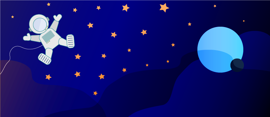
The CSS property float allows content to be placed at the right or left of its container. One thing float was always great at is wrapping text around an image inside of a paragraph, such as in the example laid out below.
<img src="...image.png" alt="">
<p>OW, since architects, painters...</p>
img { float: left; }

The text wraps around the image, but it's a bit awkward. The text flows in a very square fashion leaving a big section of white space around our figure. This is where CSS shapes come in.
Shapes
Still in draft status, CSS Shapes can be used to change the general shape of an element. Elements by default are rectangular. By using properties shape-outside and clip-path, the shape of an element can be redefined as something else than a rectangle. When content is floated against a shaped element, it will follow its newfound shape.
Shape Outside & Clip Path
The shape-outside property redefines the shape of the element for the content to wrap around.
clip-path acts like a mask, and hides parts of the image that fall outside of the parameters it is passed.
It is important to understand that everything in CSS is still rectangular, and once we start playing this little game, our borders and box shadows are going to continue to behave as though our element is rectangular. Borders and shadows within the definition of the shape will still be visible, but if they fall ouside of the area defined by clip-path they will no longer be visible. Outline will behave in much the same manner.
In both shape-outside and clip-path we can use premade shapes by using functions like circle() or create our own shape by using polygon(). Let's create our own to match our image.
Think of writing values for the polygon as if you were drawing on an Etch-A-Sketch. You are going to pass it percent-based coordinates and the function will draw a line beetween these points to create a polygon.
polygon(0% 0%, 34% 0%, 34% 30%, 100% 100%, 0% 100%)
Once our shape is written, we then pass this value to both shape outside and clip-path.
img {
  float: left;
  clip-path: polygon(0% 0%, 34% 0%, 34% 30%, 100% 100%, 0% 100%);
  shape-outside: polygon(0% 0%, 34% 0%, 34% 30%, 100% 100%, 0% 100%);
}

Shape Margin
Our text now follows the shape of our image nicely, but is a little cramped, so let's add some breathing room. I am going to use shape-margin to accomplish this task. shape-margin sets a margin for the shape which allows us to dictate the distance between the edge of our shape and our text.
img {
  float: left;
  clip-path: polygon(0% 0%, 34% 0%, 34% 30%, 100% 100%, 0% 100%);
  shape-outside: polygon(0% 0%, 34% 0%, 34% 30%, 100% 100%, 0% 100%);
  shape-margin: 2ch;
}

That's it! We have text that beautifully follows the shape we have created in order to give our typography and layout that little extra pizzazz. A copy of the code presented can be found below. Happy Coding!