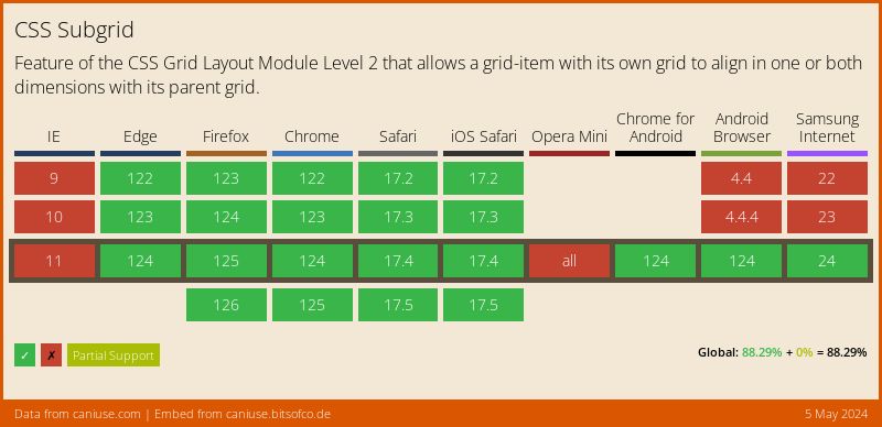
Let's create a layout using subgrid. Still rather new at the time of writing this article and not yet supported in all major browsers, one of the new features currently being implemented with in the CSS Grid Layout Module is subgrid. Figure 1 shows the current browser support for subgrid.
But first, what functionality does subgrid bring that was not previously available in grid? What subgrid does is allow child elements to be able to use the tracks created on their parent elements. In other words, child elements operate on their parent's rows and columns allowing us to align our elements much more neatly. Let's look at how this works in practice.
Subgrid
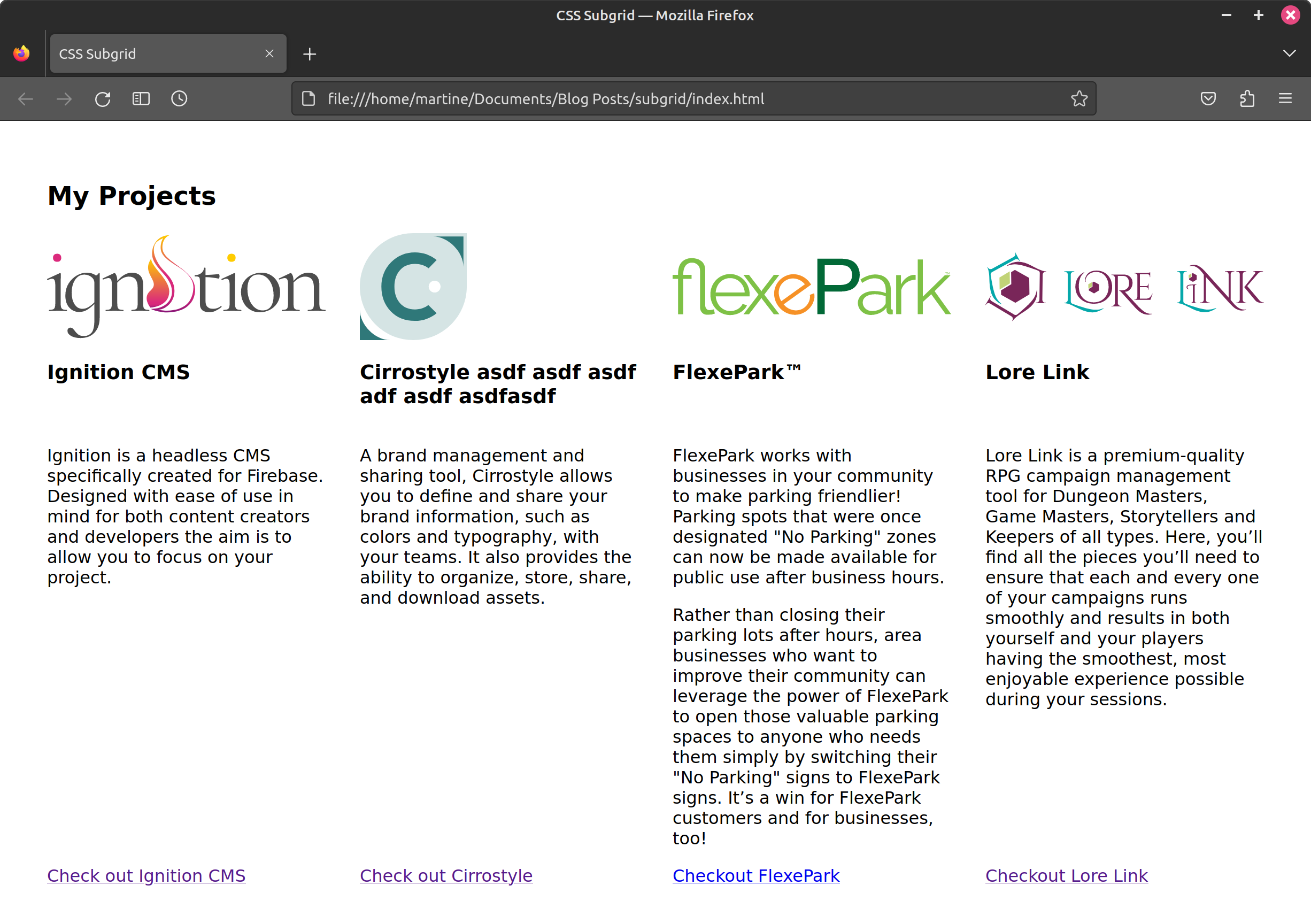
We are going to use subgrid to layout a list of 4 projects found in a list that each have an image, name, description, and link in a 4 column layout. Our HTML looks as follows (listing 1):
<section class="projects">
  <h2>My Projects</h2>
  <ul>
     <li>
       <img src="https://ignitioncms.com/img/ignition-light.svg" alt="Ignition Logo" title="Ignition" height="100">
       <h3>Ignition CMS</h3>
       <div class="content">
          <p>Ignition is a headless CMS...</p>
       </div>
       <a href="https://ignitioncms.com" target="_blank" rel="noopener">Check out Ignition CMS</a>
    </li>
    ...
  </ul>
</section>
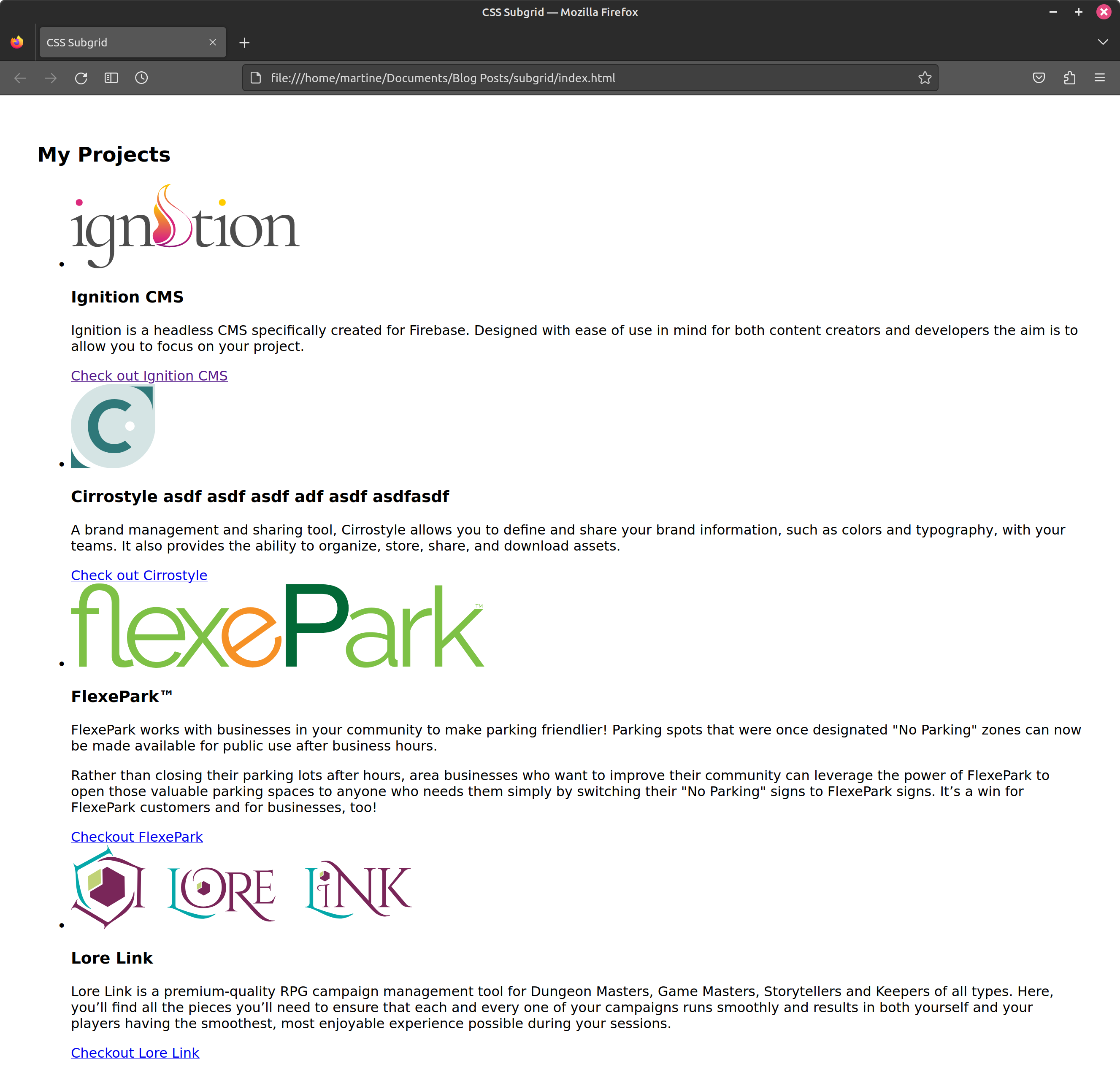
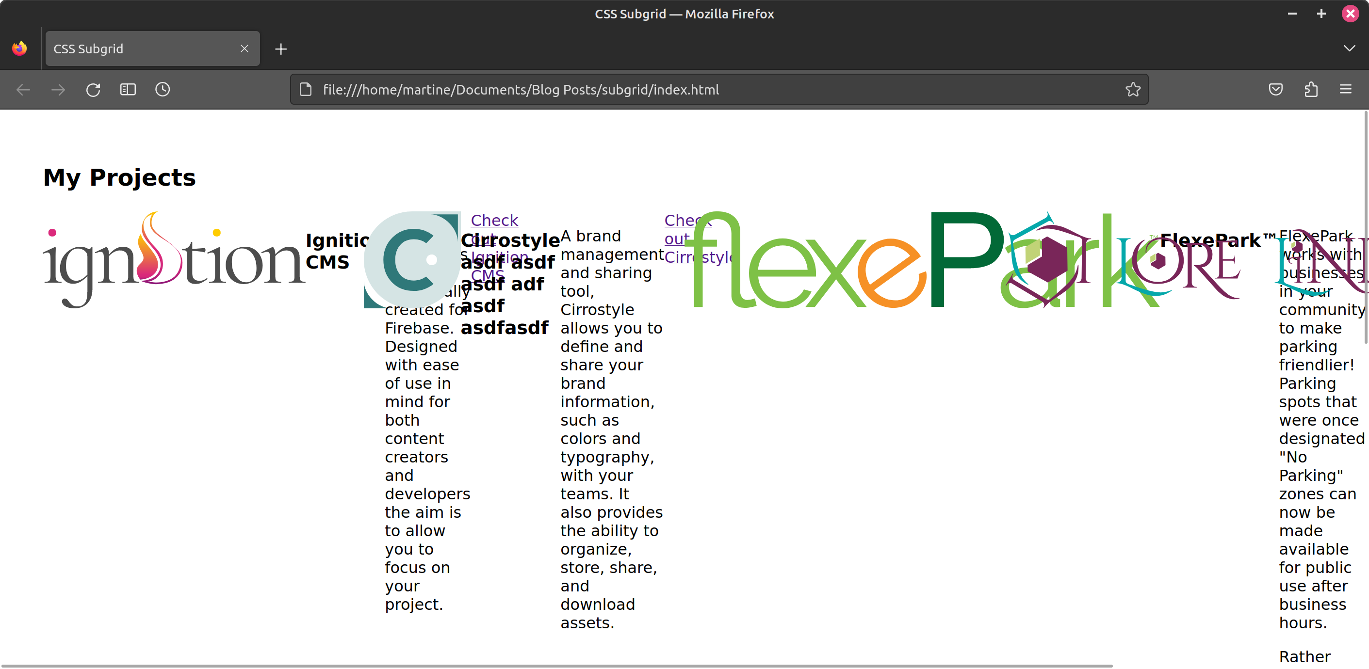
And our webpage looks as seen in figure 2.
We start by giving our list a display property value of grid and defining 4 columns (one for each project). Since we want all 4 columns to be the same width we use repeat(), which allows us to define the number of columns to create for a specified dimension. We also remove the list style and default padding from the list. Our CSS therefore looks as follows (Listing 2).
  .projects ul {
    list-style-type: none; /* remove list style (bullet points) */
    padding: 0;
    display: grid;
    grid-template-columns: repeat(4, minmax(0, 1fr));
  }
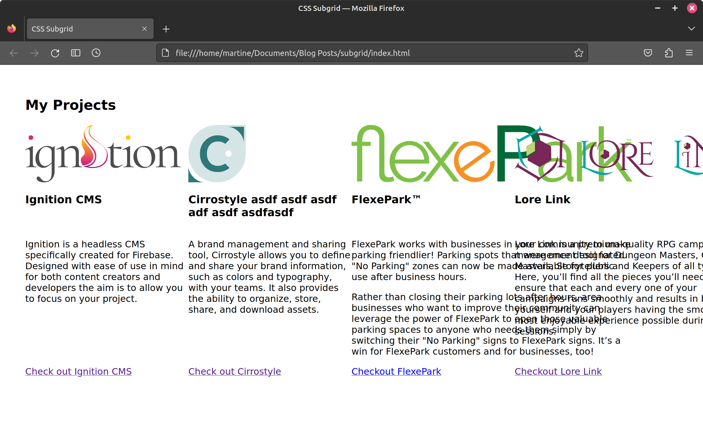
Now that we have our columns (figure 3) we can start focusing on the individual elements found within each project (image, name, description, and list).
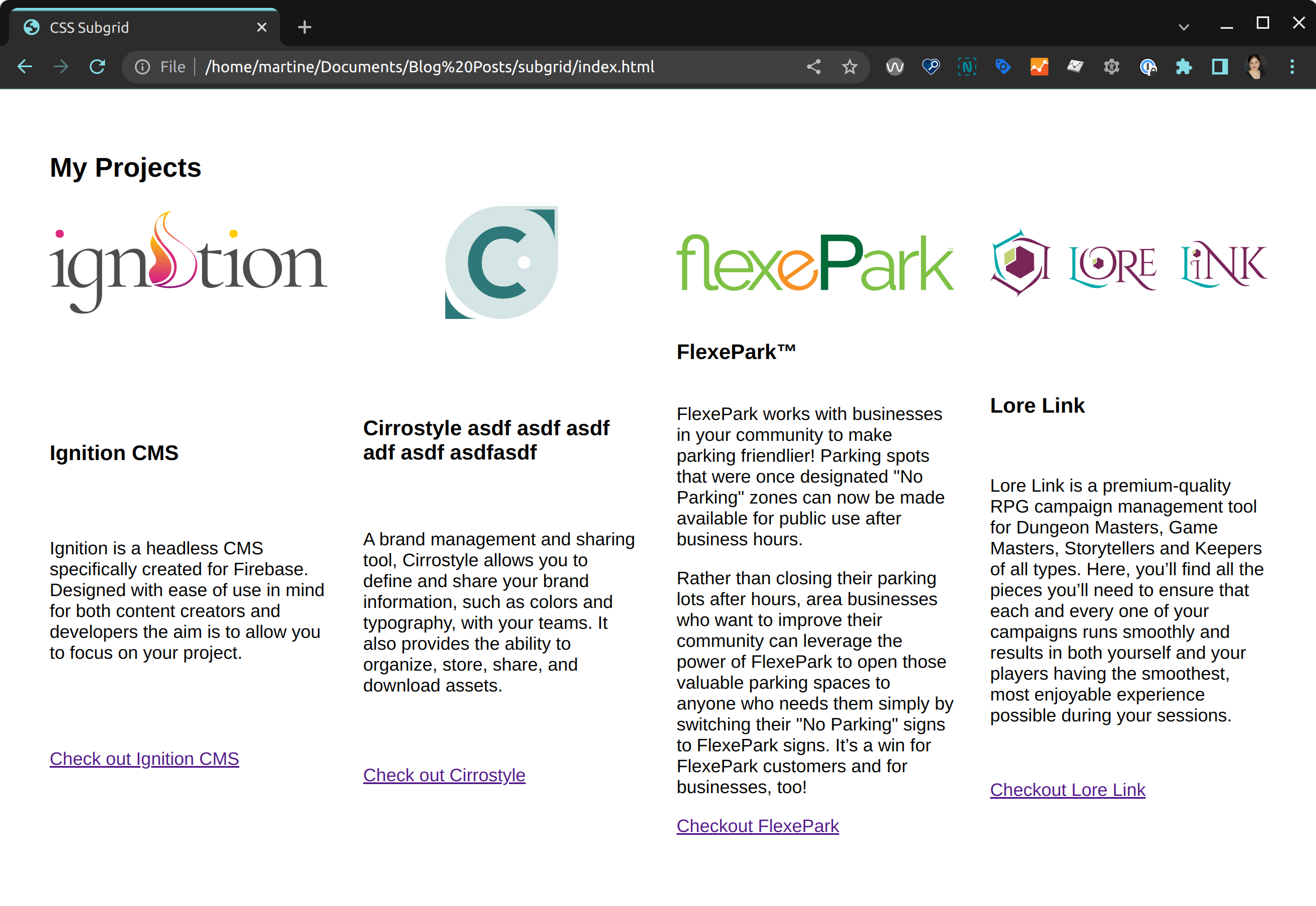
Notice that the project names and description sections are not all the same length. (Yes the extra characters at the end of the second project - Cirrostyle - are not an oversight, they are there to make the title wrap). What we want to do is have each type of content neatly aligned horizontally. We will use subgrid to achieve this.
The subgrid property value gets assigned to either grid-template-columns, grid-template-rows, or both. In our case, since we are looking for horizontal alignment, we will use it on grid-template-rows. Notice that we still need to give the project (<li>) a display value of grid (listing 3).
  .projects ul li {
    display: grid;
    grid-template-rows: subgrid;
  }
At this after applying this property, we will not notice all of our content is now found in the first row as seen in figure 3.
Let's go ahead and define our rows. This will be done on the parent (the <ul>). We are going to give each row the following values:
- First row (image):
100px - Second row (project name):
max-content - Third row (description):
auto - Fourth row (link):
max-content
Our updated list CSS will therefore look as follows (listing 4):
.projects ul {
  list-style-type: none;
  padding: 0;
  display: grid;
  grid-template-columns: repeat(4, minmax(0, 1fr));
  grid-template-rows: 100px max-content auto max-content;
}
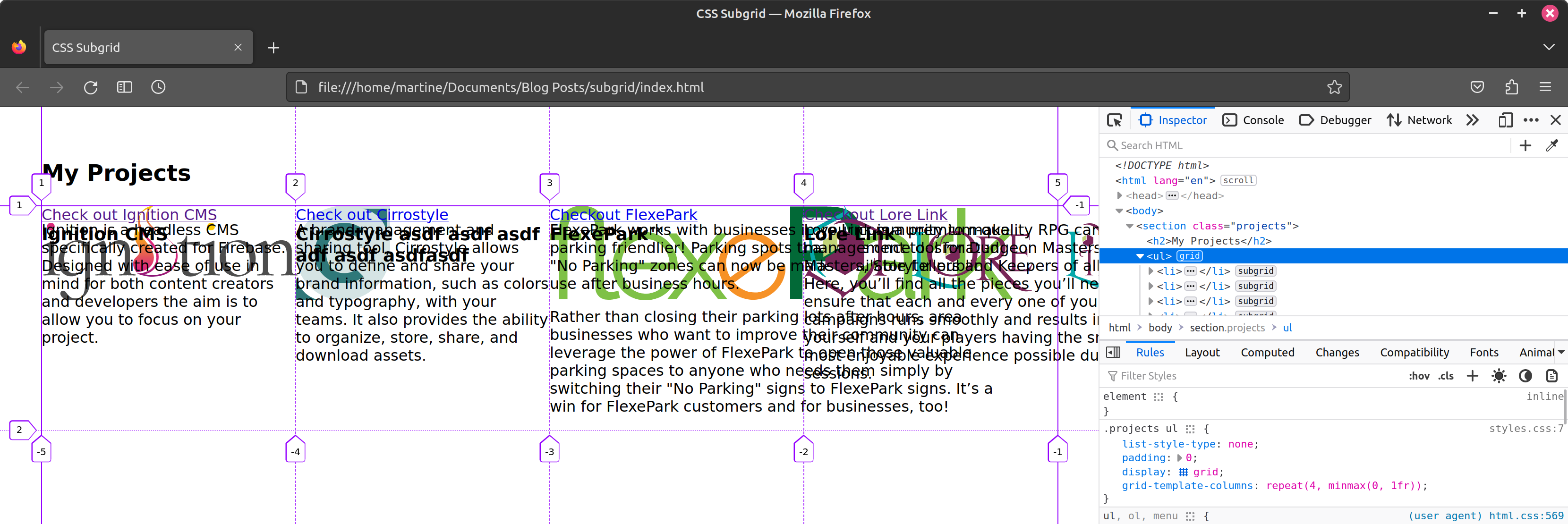
Although we defined our rows, we can see that our content is still found in the first row (figure 5). The row is now smaller, but the project's individual elements have not been distributed across the newly created rows.
Even if we explicitly assign rows to each individual project element (listing 5) we find that our content stays stubbornly stuck in that first row (figure 6).
.projects ul {
  list-style-type: none;
  padding: 0;
  display: grid;
  grid-template-columns: repeat(4, minmax(0, 1fr));
  grid-template-rows: 100px max-content auto max-content;
}
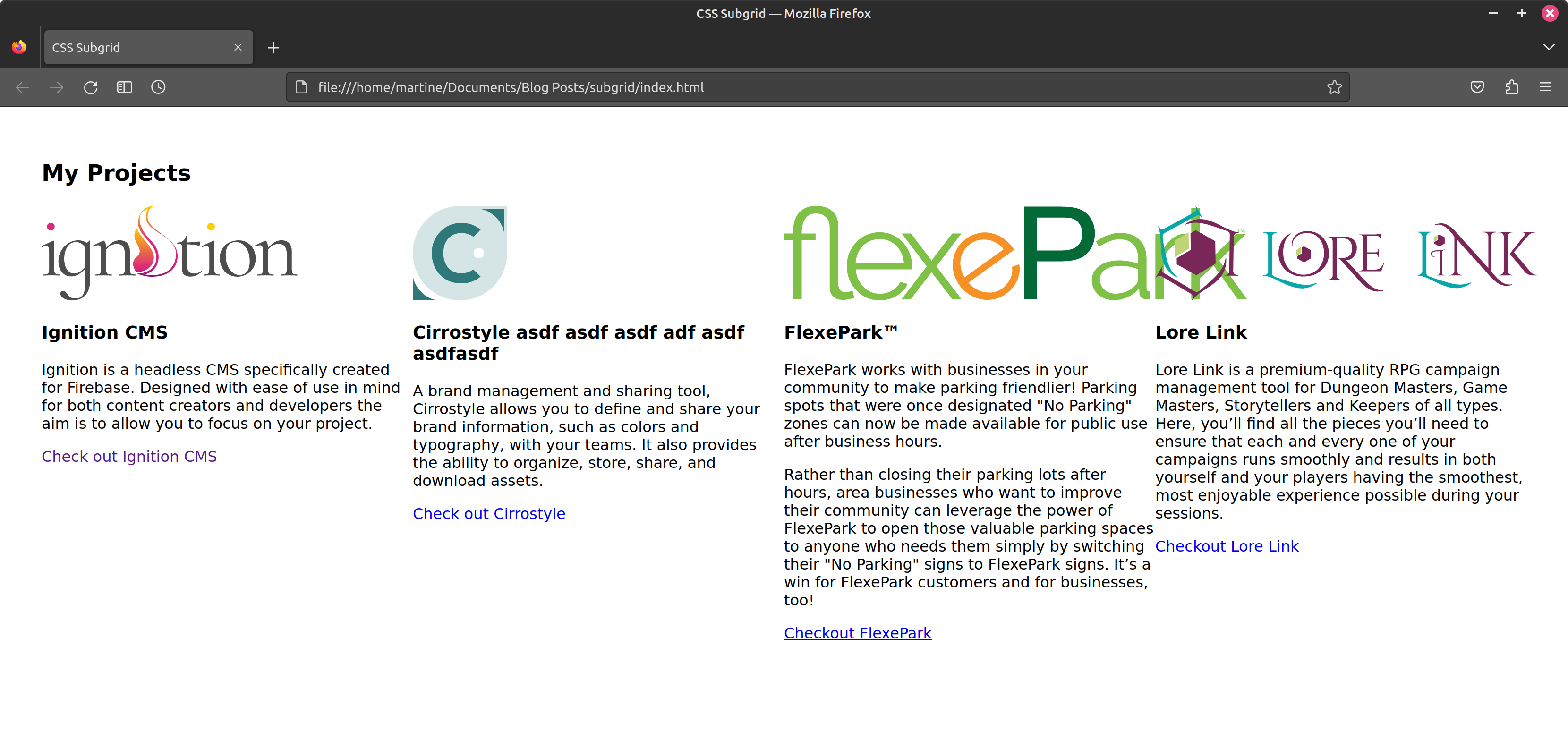
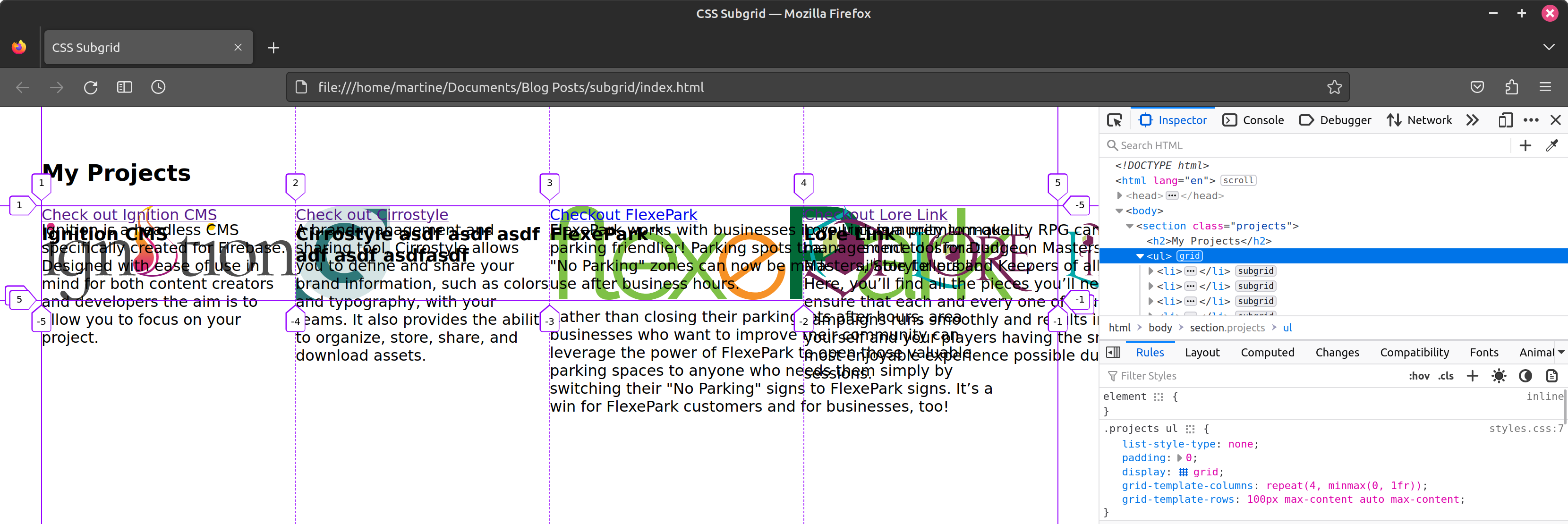
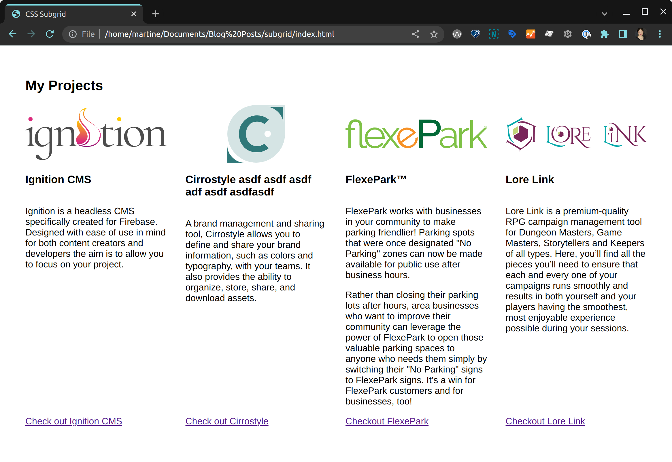
The reason the project content elements are sticking to that first row is because we have not assigned a row value to the project itself (<li>). Unless otherwise defined, by default elements will take up 1 cell's worth of space (both horizontally and vertically). We need our <li> element to span 4 rows. This will render the rows available to the subgrid and the project content will be able to align itself correctly. Once we update our <li>'s (listing 5) we see that our project elements fall into place (figure 7).
.projects ul li {
  display: grid;
  grid-template-rows: subgrid;
  grid-row: 1 / 5;
}
With our content in the correct rows, let's do a little bit of clean up. Our images extend past the width of the columns and are causing some overflow. To fix that, we will give our images a max-width of 100%.
We are also going to add some space between our columns using the gap property. Although we want to add space between the columns, we don't want to add any between the rows. We therefore assign 2 values to our declaration. A first one of 0 (row-gap) and a second of 2rem (column-gap). Listing 7 shows our updated CSS and figure 8 our progress thus far. Notice that the gap declaration is added to the list, not the individual projects.
.projects ul li img {
  grid-row: 1;
  max-width: 100%; /* constrains image width */
}

.projects ul {
  list-style-type: none;
  padding: 0;
  display: grid;
  grid-template-columns: repeat(4, minmax(0, 1fr));
  grid-template-rows: 100px max-content auto max-content;
  gap: 0 2rem; /* gap between the columns but not the rows */
}
Let's put some finishing touches on our layout. We are going to center the images horizontally in the middle of their columns and center the project names vertically in the middle of their rows. Let's start with the images. To center the images horizontally we will use justify-self with a value of center. To center to project names vertically, we use align-self also with a value of center as seen in listing 8.
.projects ul li img {
  grid-row: 1;
  max-width: 100%;
  justify-self: center; /* horizontal alignment */
}

.projects ul li h3 {
  grid-row: 2;
  align-self: center; /* vertical alignment */
}
With these final adjustments, our layout looks pretty good (figure 9) but let's take a look at what we look like in Chrome (figure 10). Spoiler, at the time or writing this article, Chrome does not support subgrid yet.
Creating a fallback
Although our layout doesn't look awful in Chrome, let's go ahead and make it a little better by adding a fallback. We are going to use the @supports at-rule to provide an alternative solution for browsers that don't support subgrid yet. By specifically adding conditional styles to browsers that don't support subgrid, we create a situation where when the property does gain support, our code will automatically start using our preferred solution. Once the property gains broad support, we can simply delete our at-rule without needing to touch the rest of our code.
Let's focus on aligning our call-to-action (the link) at the bottom of the projects. Our project already has a display value of grid so we will simply provide and alternate value for our grid-template-rows. Our rule therefore looks as follows (listing 10):
@supports not (grid-template-rows: subgrid) {
  .projects > ul li {
    grid-template-rows: 100px min-content auto min-content;
  }
}
Although not an identical layout as in Firefox, by adding the fallback we now have a working solution in Chrome that will "upgrade" itself to using subgrid once subgrid is supported by the browser (figure 11).
You can find a working version of the code on codepen at https://codepen.io/martine-dowden/pen/yLRawVP.
Happy Coding!