Ever create a component for a project or website but didn't know where it was going to be used? Or knew that depending on where it would be used it would need different styles because of the size of the space it would be contained in? With the newly added container queries, available in all major browsers, we can now style elements based on the size of the container they are placed in. They don't quite work exactly like @media queries however, so let's look at how to create one.
Let's assume we have a component with the following template (listing 1).
<template id="cardTemplate">
  <section class="about-container">
    <div class="about-card">
      <img class="about-card_img" :src="person.img" alt="">
      <h2 class="about-card_name">{{ person.name }}</h2>
      <div class="about-card_title">{{ person.title }}</div>
      <p class="about-card_bio">{{ person.bio }}</p>
    </div>
  </section>
</template>
It is an informational card about a person that contains their picture, name, title, and a short bio. This could be used in many contexts such as their profile page, user listing screen, beside a listing of their blog articles, or even in a scenario that hasn't been thought up yet. Since it could be used in a variety of scenarios, we want to make sure that it is going to look good both when the element is narrow or wide. Similarly to when we work with media queries and responsive designs, let's work narrow first and work our way towards wider designs.
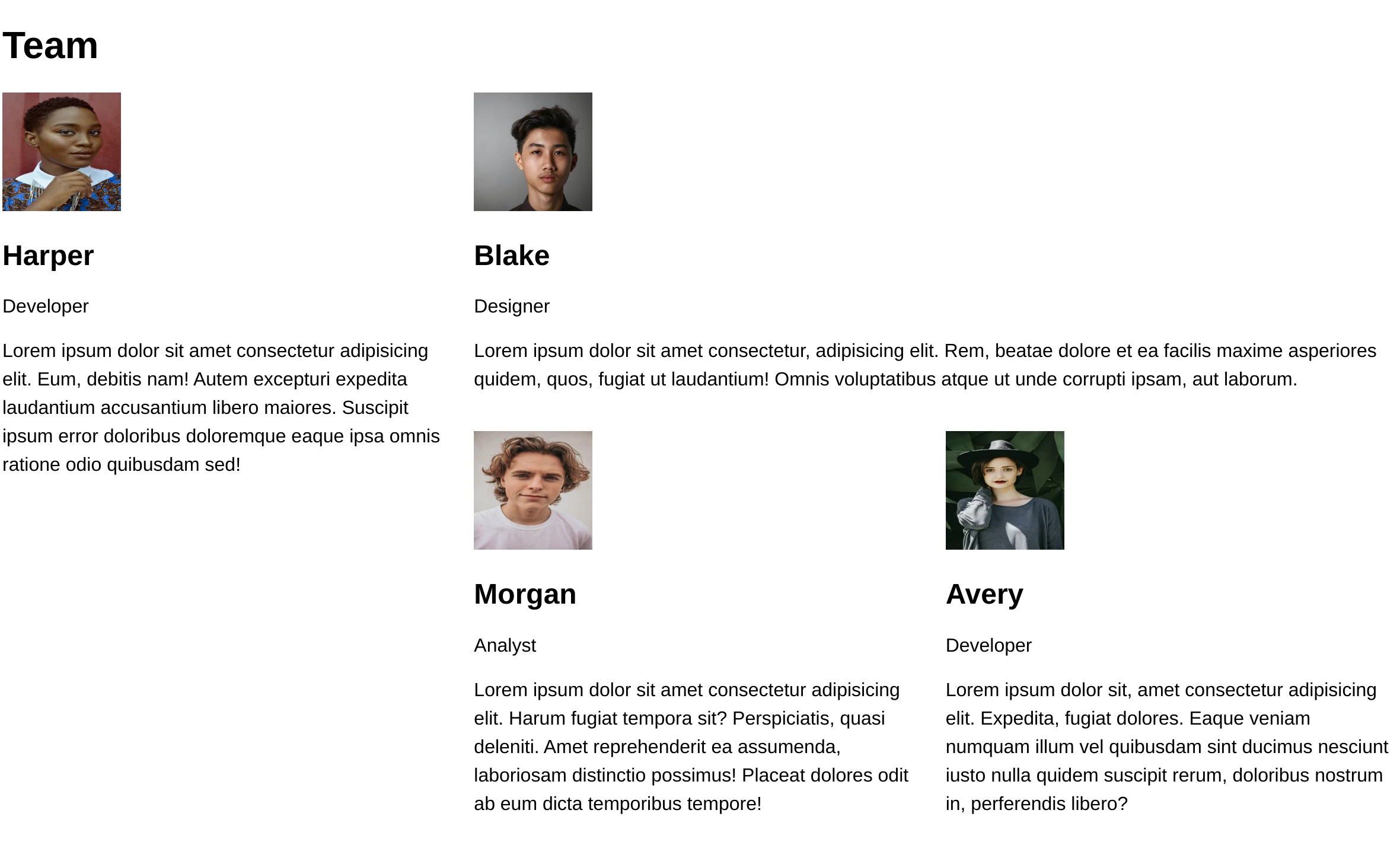
Applying our template to a list of sample profiles and laying them out on a grid so that we can see both narrow and wide cards, we get the following (figure 1):
We add some styles to achieve our design in narrow containers. We make the image round, making sure to include the object-fit property to remove the image distortion, center the the text, add some border, and a dash of color (listing 2).
/* Theme */
:root {
  font-family: sans-serif;
  --primary: slategray;
}
* { box-sizing: border-box; }
p { line-height: 1.5; }

/* Card */
.about-card {
  border-radius: 4px;
  box-shadow: 0px 0px 2px var(--primary);
  padding: 1rem;
  text-align: center;
  height: 100%;
}
.about-card_img {
  background: white;
  height: 100px;
  width: 100px;
  object-fit: cover;
  border-radius: 50%;
  border: solid 1px var(--primary);
  display: block;
  margin: 0 auto;
}
.about-card_name {
  margin-bottom: 0;
  color: var(--primary);
}
.about-cared_title {
  font-size: 0.8em;
}
So far we haven't addressed container queries. Our card is looking pretty good when it's narrow, but the text get's really long when the card is wide (figure 2).
With our narrow styles handled, we can now start focusing on the styles for when the card has a wider container (such as the one in the top right hand corner of figure 2). We will create a container query to conditionally style the card when the card's container is wider than 350px.
The container-type property
Before we jump right into writing our query styles, we first need to define our container using the container-type property. This property goes on the outermost element of our component. This is our section and it has a class of about-container (listing 3).
.about-container {
  container-type: inline-size;
}
This property defines our containment context. It tells the browser that we will want to query the container's dimension. We have 3 values available to us: size, inline-size, and normal. These refer to block and inline dimensions.
The terminology can get a little bit confusing here, because we are dealing with a <section> which is a block-level element2 despite using inline-size. The dimensions in this case refer to the direction of writing, not the presentational characteristic defined by the flow layout.
In this particular context (which is also true for Flexbox and Grid), CSS has moved away from using right and left, and looks at the direction of writing instead; therefore, inline-size in our particular example refers to the width, since our text runs horizontally across the page.
Continuing to look at the possible values as they would apply to our example, size, would base the query on both the inline (width) and block (height) dimensions of the container. And normal would only consider styles and not dimensions.
Since we only care about the width of the container (not the height) and our text flows horizontally, we are going use inline-size. With our container type defined, we can now write our container query.
@container at-rule
Much like an @media query we will define the condition for which the styles apply. We are going to change the style when the container size is larger than 350px. Our query therefore looks like this (listing 4):
@container (min-width: 350px) {
  /* rules go here */
}
This query's styles will be applied if the nearest ancestor with a container context exceeds 350 pixels.
We can get more specific though. If we name our container, we can have the query apply the styles only if that a specific container meets our criteria.
The container-name property
To name a container, we add the container-name property to our container element styles and give it a string value. We can then use this value to specify a container in our container query. This can be especially useful if multiple container queries are being used where multiple conditions could be true.
Applied to our example, our updated rules would look as follows (listing 5):
.about-container {
  container-type: inline-size;
  container-name: card;
}

@container card (min-width: 350px) {
  /* rules go here */
}
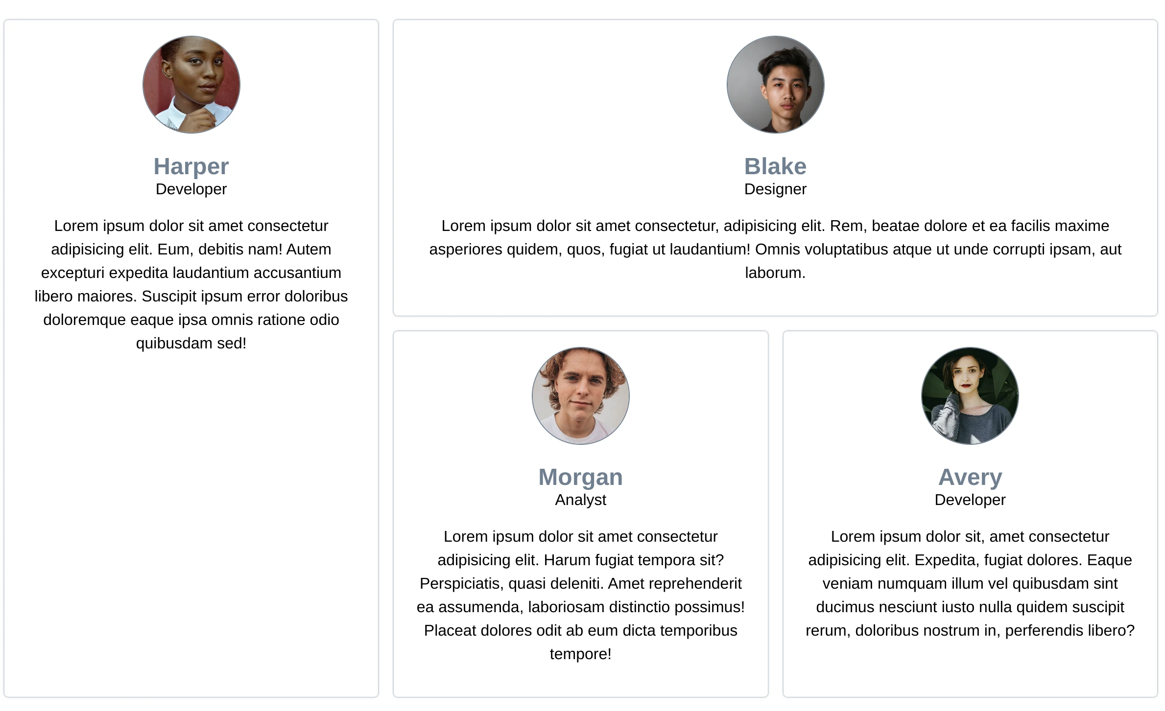
With our container context and container query defined, all that is left is to add some styles inside of the query to alter the layout of the card's contents (figure 6).
@container card (min-width: 350px) {
  .about-card {
    display: grid;
    grid-template-columns: minmax(0, 1fr) 2fr;
    grid-template-rows: repeat(3, min-content);
    gap: 0 1rem;
  }
  .about-card * {
    margin: 0;
  }
  .about-card_img {
    grid-column: 1;
    margin: 0 auto;
  }
  .about-card_name {
    grid-column: 1;
    grid-row: 2;
    margin-top: 1rem;
    align-self: end;
  }
  .about-card_title {
    grid-column: 1;
    grid-row: 3;
  }
  .about-card_bio {
    grid-column: 2;
    grid-row: 1 / 4;
    align-self: center;
  }
}
In wide containers, we change the layout so that the image, name, and title place themselves to the left of the bio, taking up more horizontal space and therefore decreasing the line length of the bio (figure 3).

There we have it! With only a few lines of code (listing 7), we were able to define a container and change our layout based on the card's position in our grid.
.about-container {
  container-type: inline-size;
  container-name: card;
}

@container card (min-width: 350px) {
  /* rules go here */
}
You can find the code used in this article below or on codepen at https://codepen.io/martine-dowden/pen/OJBzPVv.
Happy Coding!