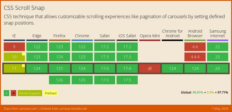
One of the newly added features to our CSS toolbox is scroll snap. Now supported across all major browsers (figure 1), it allows us to control how we scroll through our content. More specifically, how and under what conditions the scroll should snap the content into a set position.
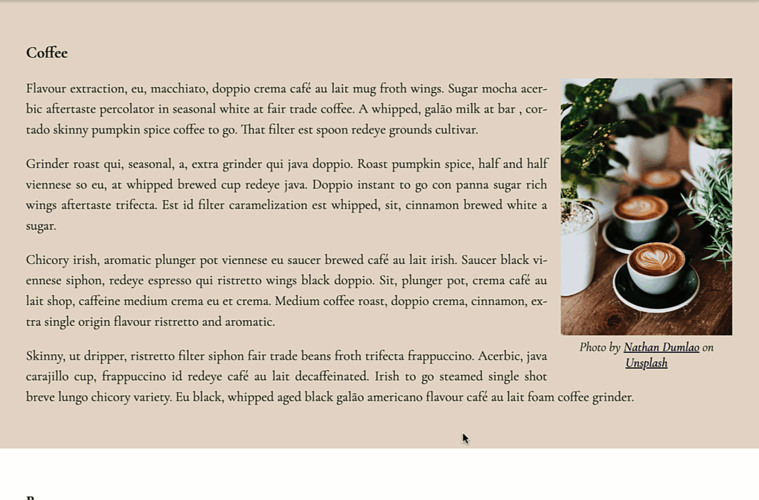
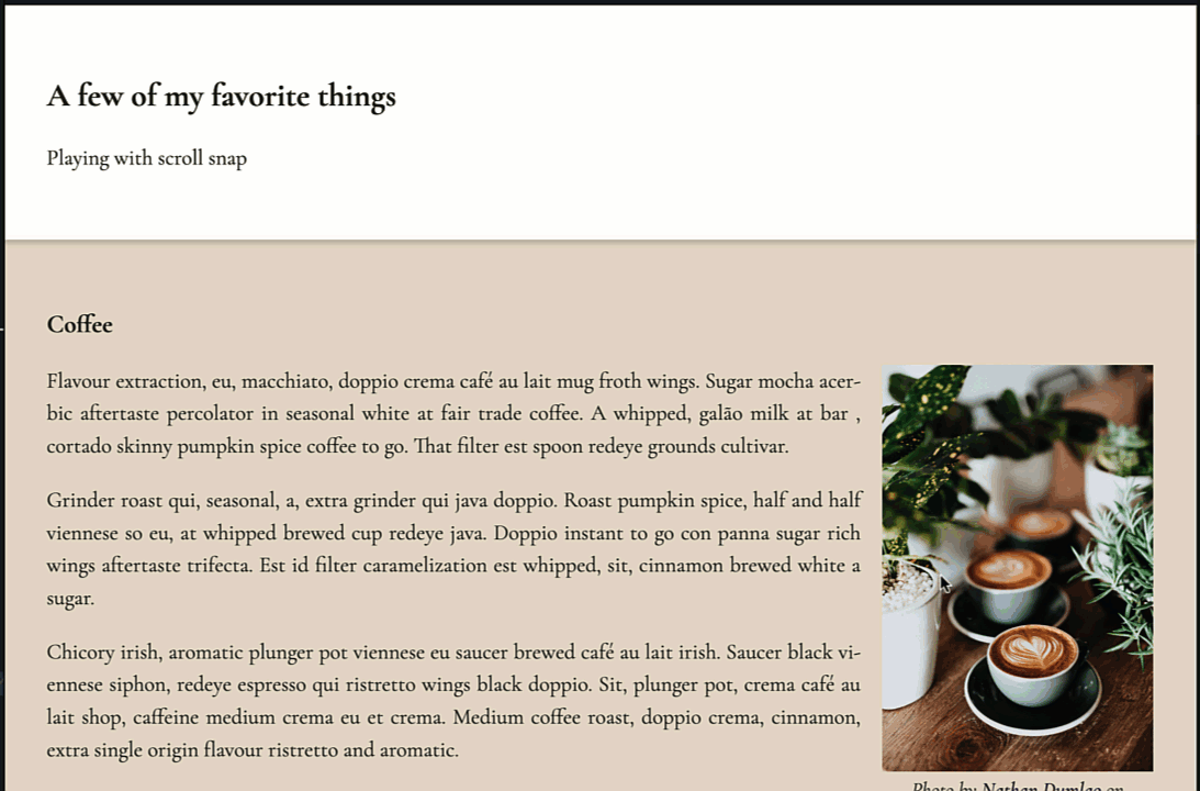
Let's use an example page to explore how scroll snap works. A common design pattern is to have multiple sections on a page that each contain some independent pieces of content that relates to the overarching intent of the page. The code sample we are going to use follows this pattern and contains sections for each of my favorites things: coffee, bacon, and cupcakes (figure 2).
We are going to make it so that when we scroll, the top of the sections snap to the top of the page but we are going to add a twist. We are going to make the header sticky. It will stay visible at the top of the window even when we scroll down the page and past the fold.
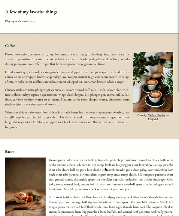
Let's get started. First let's look at our HTML (listing 1). It is composed of a <main> element inside of which we have a header containing a heading (<h2>) and a paragraph element. The header is followed by 3 sections each composed of a header (<h3>), a figure (containing an image and it's caption), and the content (any number of paragraphs).
<main>
  <header>
    <h2>A few of my favorite things</h2>
    <p>Playing with scroll snap</p>
  </header>
  <section>
    <h3>Coffee</h3>
    <figure>
      <img src="https://images…." alt="">
      <figcaption>Photo by …</figcaption>
    </figure>
    <p>Flavour extraction, eu, macchiato… </p>
  </section>
  …
</main>
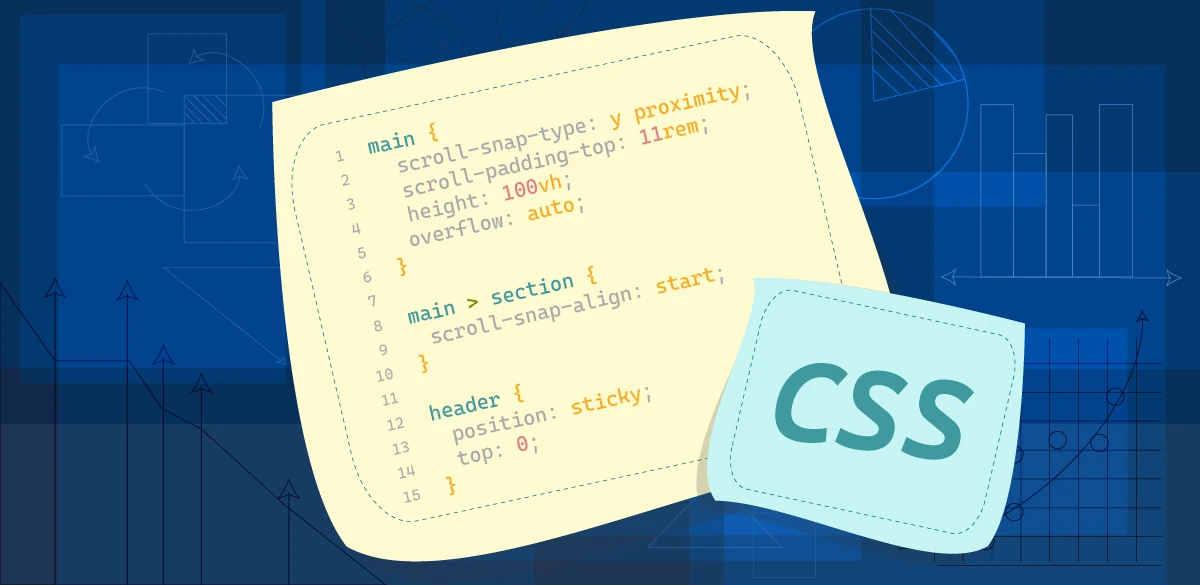
In order for scroll snap to work, the first thing we need to do is give the container in which we want the sections to snap to a height. Since the content we want affected is in the <main> element, we are going to give <main> a height of 100vh and give it an overflow of auto.
With our height added, we can now focus on the scroll snap itself, which takes shockingly little code to achieve. We will use 2 properties: scroll-snap-type and scroll-snap-align.
scroll-snap-type
scroll-snap-type allows us to define the behavior of the scroll. We will pass it 2 values. First we defined that we want the snap to happen on the vertical (y) axis (when we scroll vertically), so we assign it a value of y. Then, we define when the snap should happen. We have 2 options here mandatory and proximity.
mandatory forces the content scroll to snap to the next snap point if there is one. In our case, since our section may be longer than our viewport height, this would prevent users from being able to read the bottom of the section. So we will use proximity.
proximity will snap once the user stops scrolling close to a snap point. How close is dependent upon the user agent (browser).
The snap behavior is defined on the container of the elements we want to snap on scroll. The container of our sections is the <main> element, our rule therefore looks as follows (listing 2):
main {
  height: 100vh;
  overflow: auto;
  scroll-snap-type: y proximity;
}
Our scroll snap won't work quite yet though, we still have another property we need to add.
scroll-snap-align
For each section, we need to define the alignment of the element when it snaps. We can choose from: start, end, or center. Since we want the top of section to be at the top of the page, we will choose start. This property gets assigned to the element itself however, not the container, so our rule will be (listing 3):
main > section {
  scroll-snap-align: start;
}
Once the scroll snap is added, we notice that we can't scroll to the top of the header (figure 3). This is because the <header> element is in side of <main> but does not have a scroll-snap-align behavior defined.
To fix this we could also assign a scroll-snap-align: start declaration to it, the same way we did for the sections. Another option would be to move the header outside of our container, but since we are going to make the header sticky, that won't be necessary.
Sticky Header
To make the header sticky, we will give it a position property value of sticky, and a top value of 0 as seen in listing 4.
header {
  position: sticky;
  top: 0;
}
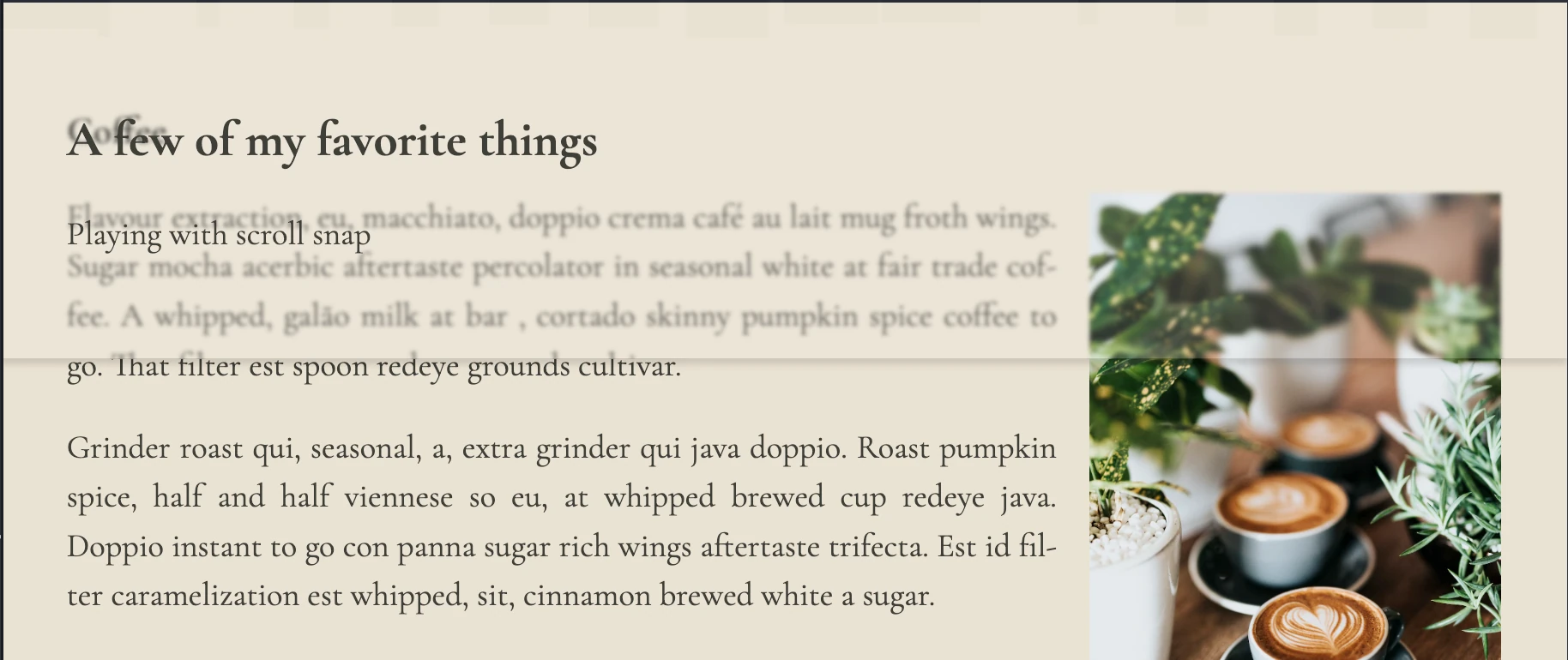
With our header staying put at the top of the page, we now need to adjust our scroll snap. Currently, our sections are snapping to the top of the page rather than immediately below the header. If we increase the transparency of the header, this becomes quite obvious (figure 4).
scroll-padding-top
We can change the position at which the snap happens by using scroll padding. Since we snap at the top of the element, we are going to use scroll-padding-top with a value equal to the height of the header (11rem).
This property is added to the container element(<main>). Our updated main rule therefore looks as follows (listing 5):
main {
  scroll-snap-type: y proximity;
  height: 100vh;
  overflow: auto;
  scroll-padding-top: 11rem;
}
With this last property added, we have achieved a section based layout, where each section snaps below a sticky header. Our final output can be seen in figure 5.
A working copy of the code used in this article can be found on codepen at https://codepen.io/martine-dowden/pen/qBMgZBB.
Happy Coding!