When we want to present data in an organized and easily consumable format, we often use tables. When we have a lot of data however, we often want to keep the headers visible as we scroll through the page. One of the most common requests I have gotten when designing a UI is “Can you make it sticky like in Excel?” So how do we create a sticky header?
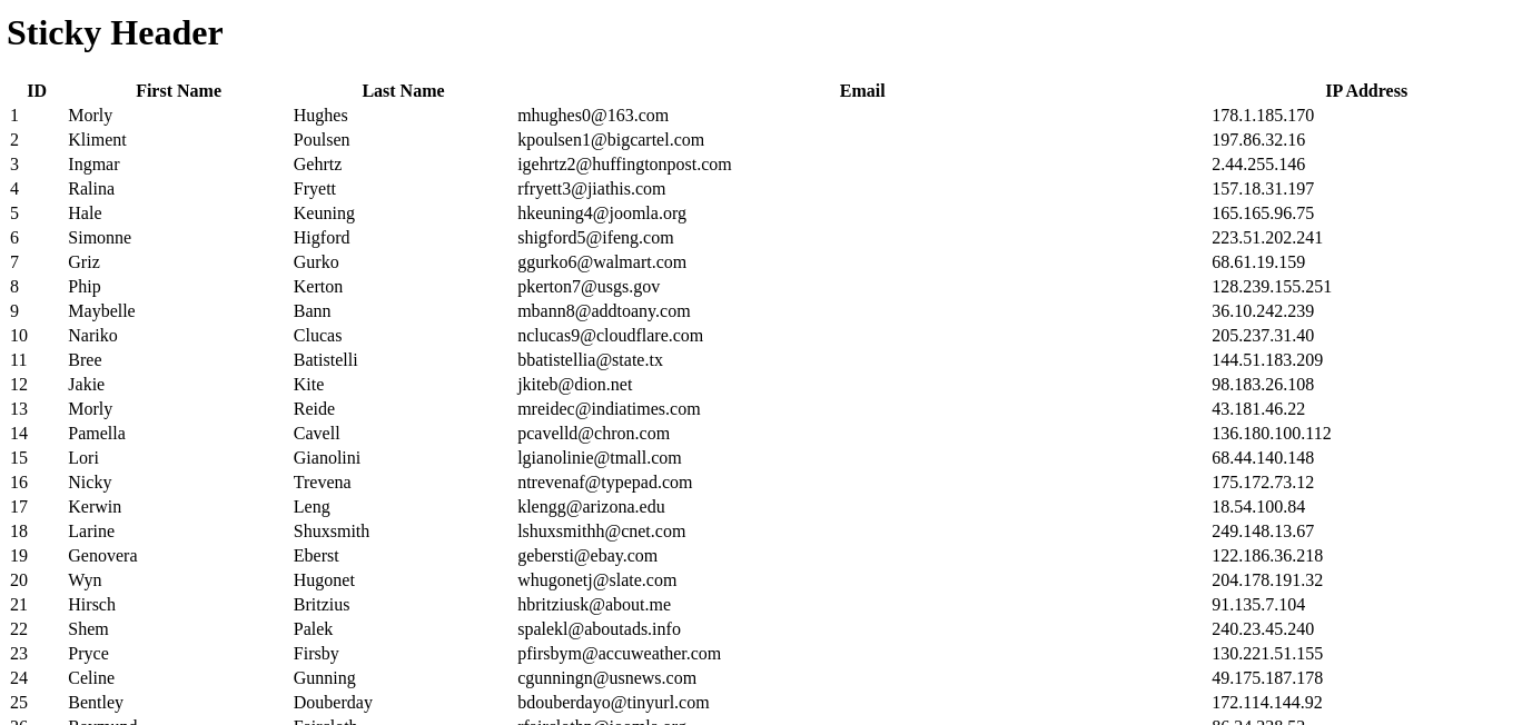
Let’s first start with a plain HTML table as seen in Listing 1. Although we only show 1 row of data in the excerpt, our example will actually contain 50 rows generated using Mockaroo.
<table>
<thead>
  <tr>
    <th>ID</th>
    <th>First Name</th>
    <th>Last Name</th>
    <th>Email</th>
    <th>IP Address</th>
  </tr>
</thead>
<tbody>
  <tr>
    <td>1</td>
    <td>Morly</td>
    <td>Hughes</td>
    <td>mhughes0@163.com</td>
    <td>178.1.185.170</td>
  </tr>
  ...
</tbody>
</table>
Since we haven’t written any CSS rules against our table yet, it is currenting being styled using the browser’s defaults (Figure 1).

Since we are currently unstyled, let’s start with some basics. First let’s make our table take up the full width of the page. To make the table take up the full width, we will write a rule which targets the table and sets its width to 100% (Listing 2).
table {
width: 100%;
}

With the table taking up the full width of the page (Figure 2), we will now give odd rows the background color of AliceBlue in order to make the data easier to read, especially when it comes to tracking information across a row.
Striped Table Rows
To target every other row (tr) inside of the table body (tbody), we use the pseudo class nth-of-type() with a value of odd.
Pseudo Classes: pseudo classes allow us to target elements based upon their state. By using nth-of-type(even), the state is the element's position inside of its parent. Our condition is odd. Styles will therefore be applied if the position index of the element is odd.
In code, our rule will look as follows (Listing 3):
tbody tr:nth-of-type(odd) {
background: AliceBlue;
}
With the striped rows added (Figure 2), we notice 2 things:
- Our data is very compact, we should increase the whitespace around our data
- Vertical white lines appear between our cells, exposed once the blue has been added

Cell Padding
To add whitespace around our data, we can give our cells some padding. We will use the padding shorthand property and set our cell padding to 12 pixels using the following declaration: padding: 12px. Because we only set one value to the padding property, our cell will have top, right, bottom, and left padding, all equal to 12 pixels. We have 2 types of cells: data cells (td) and table headers (th). We will want to make sure to add padding to both as seen in Listing 4.
td, th {
padding: 12px;
}
Figure 4 shows our table with the added padding.

Having addressed the cell padding, let’s address the white line between our cells.
Table Borders
To remove the white line between the cells we need to collapse the borders of the table. If we were to add borders to the table (Figure 5) each cell would have a box around it rather than creating a grid as we are used to seeing table borders.

The gap between each border is the white line we are seeing in our rows. If we collapse the borders, so that they form a grid rather than boxes around the cells (Figure 6), the gap will disappear, and therefore so will our white line (Figure 7).


To collapse the borders we use the border-collapse property which defines whether cells will share borders or not. We want the cells to share borders so we will use the collapse value as opposed to the separate property which is the browser’s default. We therefore update our table rule to add the border-collapse: collapse declaration (Listing 5).
table {
width: 100%;
border-collapse: collapse;
}
The last thing we will do before we make our header sticky is align the header text with the cell content.
Aligning Content
To align the table header (th) cells content to the left like the data cell (td) content, we use the text-align property. The text align property determines how the text and other inline elements will be horizontally aligned within their parent container.
Inline Elements: inline elements are those that do not break the flow of content. They do not start on a new line and only take as much room as they need for the content they contain. Text,
<span>elements, and links (<a>) are all examples of inline elements.
Since we want our text aligned to the left, we will assign the text-align property a value of left as seen in Listing 6.
th {
text-align: left;
}
With the text alignment applied (Figure 8), we are ready to make the header sticky.

Sticky Header
To make our header sticky, we will want to target the entire header (thead) and then change its position attribute value from the default of static to sticky. When positioned using sticky, the element will position itself normally per the flow of the content. A second value is defined to determine when the element is going to become sticky. As the user scrolls, and the element hits that breakdown, the element will stay stuck until the other end of the elements container also hits that breakpoint, at which point the sticky will be released.
More concretely, if we choose our sticky point value for our header to be top: 0, when the top of the header is at the top of the page it will stay stuck there until we scroll all the way past the table at which point it will be released and disappear from view. In code, our rule will look as seen in Listing 7.
thead {
position: sticky;
top: 0;
}
When we first load the page, the header will appear as usual at the top of the table (Figure 9).

As the header hits the top of the page and we continue scrolling, we notice that the header stays at the top of the page (Figure 10).

Although we see that the header is staying at the top of the table, the text is hard to read and getting lost with our other data. By giving the header a dark background and white text, we can make sure it stays visibly prominent and distinct from the rest of the data.
Again we will use the background property, but this time with the color MidnightBlue, and then change the text color using the color property. Listing 8 shows our updated thead rule.
thead {
position: sticky;
top: 0;
background: MidnightBlue;
color: white;
}
Our header now has a dark blue background both before and after scrolling (Figures 11 and 12).


Summary
We have successfully styled our table. All together our CSS rules are as follows (Listing 9):
table {
width: 100%;
border-collapse: collapse;
}
tbody tr:nth-of-type(odd) { background: AliceBlue }
td, th { padding: 12px }
th { text-align: left }
thead {
position: sticky;
top: 0;
background: MidnightBlue;
color: white;
}
A working version of the code presented here can be found below or on CodePen at https://codepen.io/martine-dowden/pen/rNdBXvV.
To learn how to handle tables on mobile devices and small screens check out my blog post on Responsive Tables. If you enjoyed this post, please check out my new book: Tiny CSS Projects. It contains 12 projects each going over common CSS layouts and concepts including grid, flexbox, animations, float and much much more.
Happy Coding!


