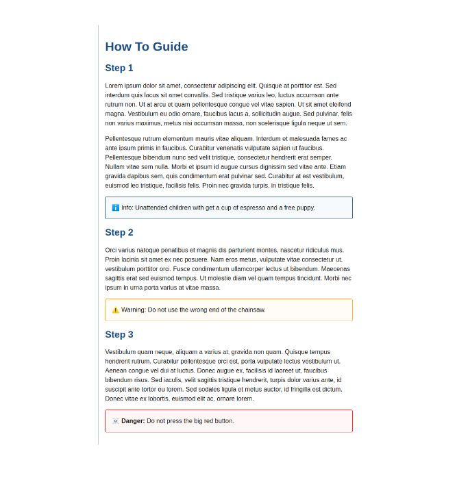
One of the really cool features of Sass are mixins. These are a great way to make DRY code that can be parameterized and reused. However, with complex code sometimes comes the need for debugging. In this post we will use a mixin to generate classes for some information panels and show techniques for debugging our code. Let's consider the following example (Figure 1) which has 3 different types of informational panels: info, warning, and danger.
Note: We will be using the SCSS syntax for our Sass in this article.

The HTML is pretty simple (Listing 1), comprised of some headers and paragraphs. The elements that are going to be of interest to us are the 3 paragraphs with the following classes: info, warning, and danger.
<main>
  <h1>How To Guide</h1>
  <h2>Step 1</h2>
  <p>Lorem ipsum dolor sit amet, ...</p>
  <p>Pellentesque rutrum elementum ...</p>
  <p class="info">Unattended children with get a cup of espresso and a free puppy.</p>
  <h2>Step 2</h2>
  <p>Orci varius natoque penatibus...</p>
  <p class="warning">Do not use the wrong end of the chainsaw.</p>
  <h2>Step 3</h2>
  <p>Vestibulum quam neque...</p>
  <p class="danger">Do not press the big red button.</p>
</main>
In our styles there are many similarities, the padding, border-radius, and border-styles however, there are some rather distinct differences as well including the background and border colors as well as the icon.
In order to prevent from having to copy paste or duplicate code, we can use a mixin to generate the classes for each of the informational panels. A mixin starts with an @ and then includes the mixin's name and any parameters which will be passed into the mixin. Ours will be called createPanel.
In this panel we will pass 2 parameters: the panel type and the color which we want to apply to it. Our mixin will therefore start as follows. @mixin createPanel($type, $color) { }. We also create a map we can then iterate over which will call our mixin to generate our class.
Creating the Map
Let's start with our map. A map is similar to an Object in JavaScript. Ours will include all of the information we need for each panel type: the class name, which we will use as our key, the icon, and the color as seen in Listing 2.
$danger: red;
$warning: orange;
$info: #1a4d80;

$messages: (
  info: (icon: ℹ️, color: $info),
  warning: (icon: ⚠️, color: $warning),
  danger: (icon: ☠️, color: $danger )
);
Iterating over a map using @each
We can then iterate over our map in order start generating our classes using @each which is the Sass equivalent to the JavaScript Array.prototype.forEach(). The syntax however is a little bit different. We start with @each and then define the variable for the key, then the key value, and finally identify which map we want to iterate over. So our function will look as follows (Listing 3). We iterate over our $messages map and for each element in our map will call our createPanel mixin. To use a mixin we use the @include followed byt the mixin name and any parameters it will take. In our case the key, which is the class name, and the type which contains the icon and color information.
@each $key, $type in $messages {
  @include createPanel($key, $type)
}
We can now start working on our mixin which will generate the class for each type. First we setup the mixin itself (Listing 4).
Debugging
One of the useful tools we can use to help us debug our code and gain visibility into what is happening in our code is @debug. The Sass equivalent of JavaScript's console.log() it allows us to print information to the console. We can see it in use inside of the mixin.
@mixin createPanel($name, $type) {
  @debug $name $type
}
The console output of the @debug statement above includes the file and line number the debug statement originated from followed by the debug value as seen in Listing 5.
styles.scss:40 Debug: info (icon: ℹ️, color: #1a4d80)
styles.scss:40 Debug: warning (icon: ⚠️, color: orange)
styles.scss:40 Debug: danger (icon: ☠️, color: red)
Compiled styles.scss to styles.css.
Retreiving values from maps
We have all of the values we need to create our class but it's not in the most usable format. Let's assign those values to variables to make the values easier to access and the code easier to read. To achieve this end will will need to access the value icon and color values inside of the $type map.
To do so we use the following syntax map.get(mapName, value). Therefore, to create icon and color variables we apply the following (Listing 6).
@use 'sass:map';

...

@mixin createPanel($name, $type) {
  @debug $name $type;
  $_icon: map.get($type, icon);
  $_color: map.get($type, color);
}
Notice the @use 'sass:map'; at the beginning of Listing 6. We must import map in order to retrieve the values otherwise we will get a Error: There is no module with the namespace "map". error. Now that we have easy access to our class name, icon, an color, let's build our our class.
Creating the Panel Classes
Interpolation
When we want to embed a the value of a variable such as when creating our class rule where we want to concatenate a . and the panel type name, we use interpolation. From a practical standpoint, it means that we wrap our variable in brackets preceded by a pound sign: .#{$name} { }.
Inside of our panel class we extend our base panel class and then define our background and border color. There is a lot going on in those 3 lines of code, so let's break it down line by line.
.panel {
  padding: 1rem;
  border: solid 1px;
  border-radius: 4px;
}

@mixin createPanel($name, $type) {
  @debug $name $type;
  $_icon: map.get($type, icon);
  $_color: map.get($type, color);
  .#{$name} {
    @extend .panel;
    background: scale-color($_color, $lightness: +97%);
    border-color: $_color;
  }
}
@extend
Extend has similarities to mixins but has a very different output. As much as they are both used for code reusability, unlike mixins, @extend does not take parameters, nor does it generate new classes. @extend appends the list of selectors with the class being extended. Our CSS output code in Listing 7 will therefore look as follows.
/** @extend output **/
.panel, .danger, .warning, .info {
  padding: 1rem;
  border: solid 1px;
  border-radius: 4px;
}

/** @mixin output **/
.info {
  background: #f6fafd;
  border-color: #1a4d80;
}
.warning {
  background: #fffcf7;
  border-color: orange;
}
.danger {
  background: #fff7f7;
  border-color: red;
}
The reason we don't add the padding, border, and border radius inside of our mixin directly and choose to extend the panel class is because of bloat. If we were to include these properties in the mixin, they would be copied inside each of the panel types. By using @extend we prevent this repetition in our code, decreasing our file size and therefore increasing performance. As a general rule, if the code needs parameterized, we use mixins, otherwise, we use @extend.
Scale-Color()
After extending our base panel class, apply an edited version of the base color to our background. We want to significantly lighten the color in order to make sure our text remains legible. To lighten the color we use the scale-color() function.
The function can takes the following parameters to allow us to manipulate the color, saturation, lightness, or transparency: scale-color($color: <color>, $red: number, $green: number, $blue: number, $saturation: percentage, $lightness: percentage, $alpha: number). Since we are only looking to make the color lighter, we pass the color we want to alter and then significantly increase the lightness: background: scale-color($_color, $lightness: +97%);.
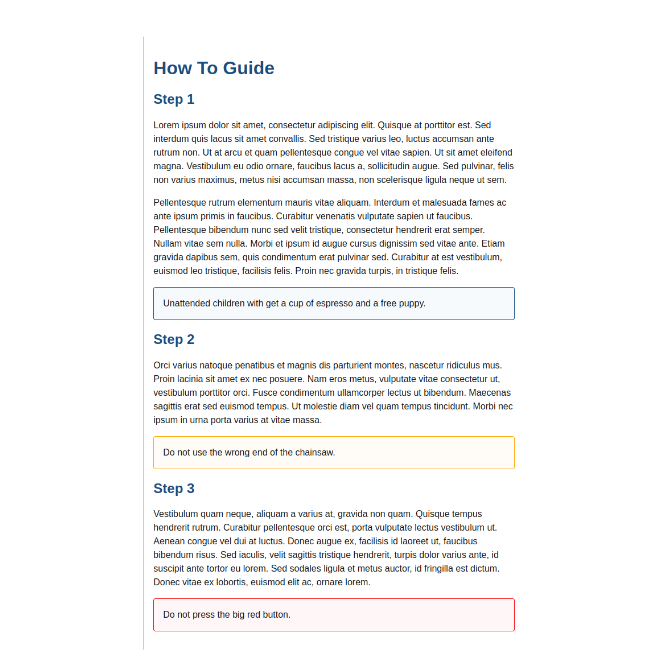
At this point, we have our classes built and are giving each panel their appropriate colors (Figure 2) but still need to add the panel type and icon before the text in the paragraph.

Conditional styles using @if
To add the text and icon before the text in each panel we will leverage the ::before pseudo-element. The icon and name are applied to the content property. We use interpolation for the content because we want to apply the variable's value in the property value.
To make the font bold for the danger panel we will use @if conditionally bolding the text when it is equal to danger.
In order to capitalize the panel type name, we add the text-transform property in the ::before pseudo-element of the .panel base class instead of the mixin because this property is added to all of the panels. This is not something that is conditionally applied, we therefore want to make that part of the include so that the property does not get repeated in each of the type specific classes.
Listing 9 shows our updated code.
.panel {
  padding: 1rem;
  border: solid 1px;
  border-radius: 4px;
  &::before {
    text-transform: capitalize;
  }
}

@mixin createPanel($name, $type) {
  @debug $name $type;
  $_icon: map.get($type, icon);
  $_color: map.get($type, color);
  .#{$name} {
    @extend .panel;
    background: scale-color($_color, $lightness: +97%);
    border-color: $_color;
    &::before {
      content: "#{$_icon} #{$name}: ";
      @if $name == 'danger' {
        font-weight: bold;
      }
    }
  }
}
An important note about equalities in Sass is that it does not apply truthiness the same way as JavaScript. Empty strings, empty lists, and 0 are all truthy in Sass. Only false and null are considered falsy.
With this last bit of code added we successfully styled our information panels leveraging a map, mixin, include, color-function, and if at-rule. By leveraging these Sass features we are able to write succinct code preventing the the need to duplicate code. Listing 10 shows the completed SCSS.
@use 'sass:map';

$primary: #1a4d80;
$default: #111;
$border-color: #ddd;

$danger: red;
$warning: orange;
$info: #1a4d80;

$messages: (
  info: (icon: ℹ️, color: $info),
  warning: (icon: ⚠️, color: $warning),
  danger: (icon: ☠️, color: $danger )
);

.panel {
  padding: 1rem;
  border: solid 1px;
  border-radius: 4px;
  &::before {
    text-transform: capitalize;
  }
}

@mixin createPanel($name, $type) {
  @debug $name $type;
  $_icon: map.get($type, icon);
  $_color: map.get($type, color);
  .#{$name} {
    @extend .panel;
    background: scale-color($_color, $lightness: +97%);
    border-color: $_color;
    &::before {
      content: "#{$_icon} #{$name}: ";
      @if $name == 'danger' {
        font-weight: bold;
      }
    }
  }
}

@each $key, $type in $messages {
  @include createPanel($key, $type)
}
Furthermore, we can see in the CSS output (Listing 11) that by leveraging a combination of @mixin and @extend our output does not contain duplicate code either.
.panel, .danger, .warning, .info {
  padding: 1rem;
  border: solid 1px;
  border-radius: 4px;
}
.panel::before, .danger::before, .warning::before, .info::before {
  text-transform: capitalize;
}

.info {
  background: #f6fafd;
  border-color: #1a4d80;
}
.info::before {
  content: "ℹ️ info: ";
}

.warning {
  background: #fffcf7;
  border-color: orange;
}
.warning::before {
  content: "⚠️ warning: ";
}

.danger {
  background: #fff7f7;
  border-color: red;
}
.danger::before {
  content: "☠️ danger: ";
  font-weight: bold;
}
The full working version of the code presented in this post can be found on github. It can also be found on codepen however, in order to see @debug work you will need to run the code locally. It does not seem as though codepen has the ability to view SCSS debug statements at the time of writing this post.
Happy Coding!


