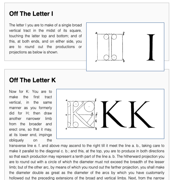
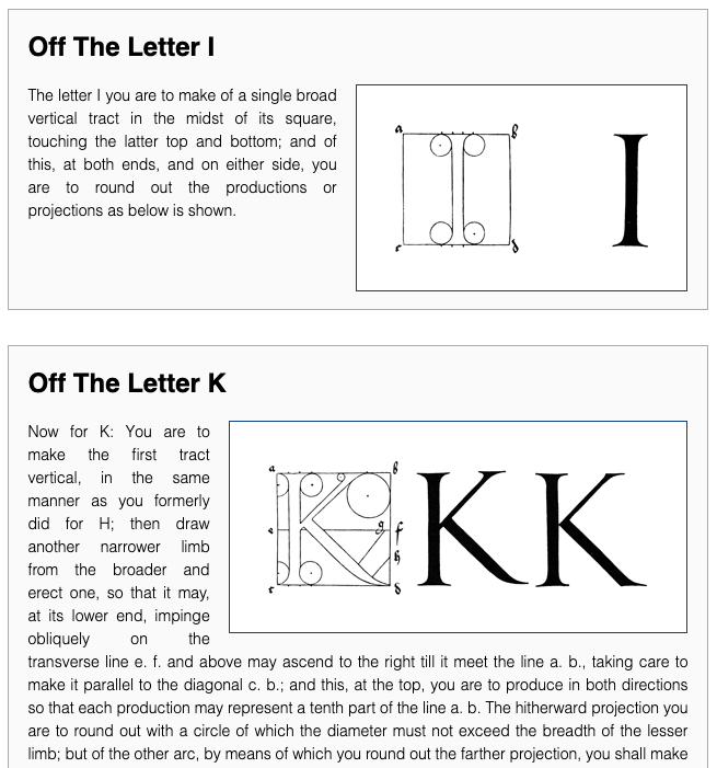
Even though we have many more options than we used to for layouts, there are still things that CSS float has no replacements for, like wrapping text around an image. One thing that hasn’t changed however, is the need to make float behave. More often than not, it’s the same old scenario: We have a background or border around our container and the floated element is sticking out.

What we ultimately want is for the image to be contained inside of the card. To achieve this, we have historically used all sorts of hacks to achieve this.
clear="both"
One option was to add a tag, often a line break (<br>) to which we would add a clear=“both” in order to clear the float and extend the container. The downside to this technique is that the added tags have no other purpose than to handle layout and styling intricacies. Maintainability was not ideal either, because if we chose to no longer float for example, we had to go find all these extra tags and remove them one by one. Listing 1 shows the clear=“both” trick applied to our html.
<div class="card">
  <h2>Off The Letter I</h2>
  <img src="i.png" alt="">
  <p>The letter I you are to make of a single broad vertical tract in the ...</p>
  <br clear=“both”>
</div>

<div class="card clearfix">
  <h2>Off The Letter K</h2>
  <img src="k.png" alt="">
  <p>Now for K: You are to make the first tract vertical, in the same ...</p>
  <br clear=“both”>
</div>
Clearfix
Another very popular option was clearfix (Listing 2) which unlike clear="both" had the advantage of not requiring adding unnecessary tags to the markup.
.clearfix:after {
  visibility: hidden;
  display: block;
  font-size: 0;
  content: " ";
  clear: both;
  height: 0;
}
.clearfix { display: inline-block; }
/* start commented backslash hack \*/
* html .clearfix { height: 1%; }
.clearfix { display: block; }
/* close commented backslash hack */
This technique was later streamlined and renamed to group (Listing 3).
.group:before,
.group:after {
  content: "";
  display: table;
}
.group:after {
  clear: both;
}
Applied to our HTML (Listing 4), we add the clearfix class, or if using group then the group class to our card and the image now fits inside of its container.
<div class="card clearfix">
  <h2>Off The Letter I</h2>
  <img src="i.png" alt="">
  <p>The letter I you are to make of a single broad vertical tract in the ...</p>
</div>

<div class="card clearfix">
  <h2>Off The Letter K</h2>
  <img src="k.png" alt="">
  <p>Now for K: You are to make the first tract vertical, in the same ...</p>
</div>
Both of the above techniques achieve the desired results but they are still workarounds. We now have a property value to do achieve the same results, which for the first time, is not a hack. We can now use display: flow-root.
display: flow-root
The CSS specification defines the flow root behavior as follows:
The element generates a block container box, and lays out its contents using flow layout. It always establishes a new block formatting context for its contents.
By setting our card's display property to flow-root, the card content will follow the normal flow layout, therefore our image will be floated as directed, but because the content has it's own block formatting context, the container will take the size of the card content including the floated image that would have extended passed it. In short it achieves the same results as the above 2 tricks but without the hacks. Our CSS (Listing 6) therefore look as follows:
.card {
  display: flow-root;
}
We don't need any special classes or extras, we can simply add flow-root as a value to the display property for our card and get the desired result (Figure 2).

So without any hacks or special knowledge, dutifully passed on from one generation of developers to another, we have a documented, consistent, baked-in solution. A full copy of the code presented in the article can be found below.
Happy Coding!


