Tables have gotten a bad reputation over the years. Historically, we used them for layout, a practice thoroughly frowned upon today. When responsive and fluid layouts came into the scene, they proved difficult to work with. As a result, we have shied away from them but it doesn't have to be this way. Using media queries we can use a basic HTML table and make it work well on narrow and wide screens alike.
When to use tables
The first thing to do is establish whether we should use a table at all. As early as 1997, we already knew that tables for layout were problematic.
HTML 3.2 includes a widely deployed subset of the specification given in RFC 1942 and can be used to markup tabular material or for layout purposes. Note that the latter role typically causes problems when rending to speech or to text only user agents. (Raggett)
So how do we recognize tabular data, so we can make sure to keep our content accessible?
Tabular Data
Tabular data is described by the W3C as
data that is structured into rows, each of which contains information about some thing. Each row contains the same number of cells (although some of these cells may be empty), which provide values of properties of the thing described by the row (“Model for Tabular Data and Metadata on the Web”).
Basically, we can think of it as, is this data I would put in a spreadsheet? If the answer to this is yes, we are most likely dealing with tabular data.
Making a responsive table
Once we have established that the information we want to display is tabular, we can start putting together our table.
The HTML
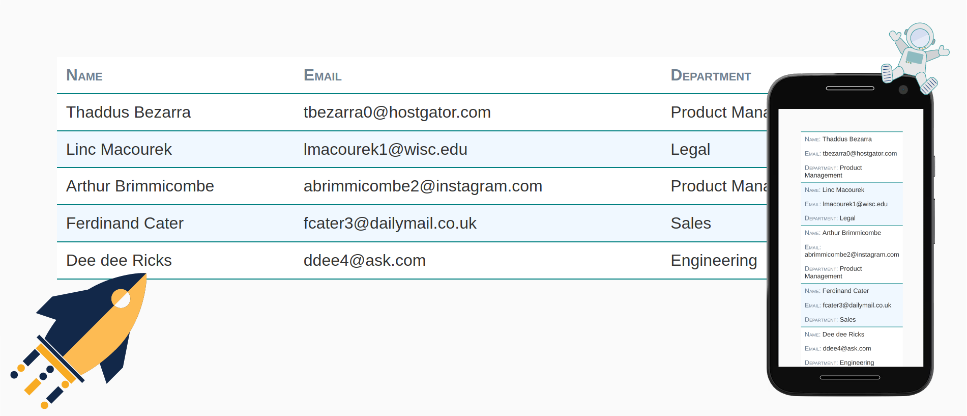
We are going to start with a simple table.
<table>
  <thead>
    <tr>
      <th>Name</th>
      <th>Email</th>
      <th>Department</th>
    </tr>
  </thead>
  <tbody>
    <tr>
      <td>Thaddus Bezarra</td>
      <td>tbezarra0@hostgator.com</td>
      <td>Product Management</td>
    </tr>
    <tr>
      <td>Linc Macourek</td>
      <td>lmacourek1@wisc.edu</td>
      <td>Legal</td>
    </tr>
    ...
  </tbody>
</table>
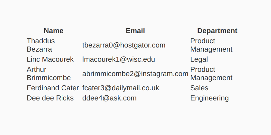
Some basic styles
Currently, our table is just the bare bones. We are therefore going to start by adding some basic styles that are going to apply regardless of the screen size.
We want the table to:
- make the table take the full width of the screen
- make sure our borders collapse
- add a white background
table {
  width: 100%;
  border-collapse: collapse;
  background: #fff;
}
Handling narrow screens
Whether a mobile phone or a narrow screen, tables often overflow the screen width. Our table only has three columns and already has left right scroll on a mobile phone.
Because the screens are narrow, we are going to stack the data vertically. To accomplish this we are going to use a display value of block on our table elements.
tbody, thead, tr, th, td { display block; }

The table header
Now that we have stacked the data, having the header information at the top of the table doesn't make sense anymore. We are therefore going to hide it visually. We don't want to remove it from the DOM three however because assistive technologies need this information so we are going use absolute positioning to move it off screen.
thead {
  position: absolute;
  left: -9999rem;
}

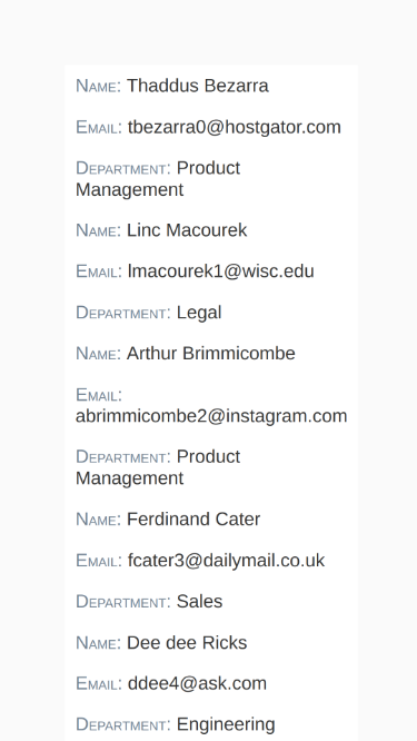
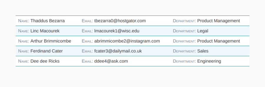
As much as programmatically we still have the header information we loose the context of what the rows represent visually. So let's restore this information in a way that will work on mobile. To reinstate the headers we are going to make a small edit to the HTML. We are going to add a data-header attribute to each cell which contains the header information for that cell.
<tbody>
  <tr>
    <td data-header="Name">Thaddus Bezarra</td>
    <td data-header="Email">tbezarra0@hostgator.com</td>
    <td data-header="Department">Product Management</td>
  </tr>
  <tr>
    <td data-header="Name">Linc Macourek</td>
    <td data-header="Email">lmacourek1@wisc.edu</td>
    <td data-header="Department">Legal</td>
  </tr>
  ...
</tbody>
We are then going to use CSS to display the content of the attribute before the cell. We are also going to add some styles to differentiate between the header and content information.
th, td { padding: 1ex 1ch; }

td:before { content: attr(data-header) ": "; }

th, td:before {
  color: slategray;
  font-weight: regular;
  font-variant: small-caps;
  text-transform: capitalize;
  text-align: left;
}
Let's break down the code a little bit. To get the header information we added inside of the data-header attribute to display, we use the content property with a attr(data-header) property. This is the part that gets the content. We can then add ": to include a colon after the header text.
We also style the header information. In order to make sure that our styles stay consistent when we are on wider screens, we go ahead and use the th selector with our td:before even though the th elements are not currently visible.
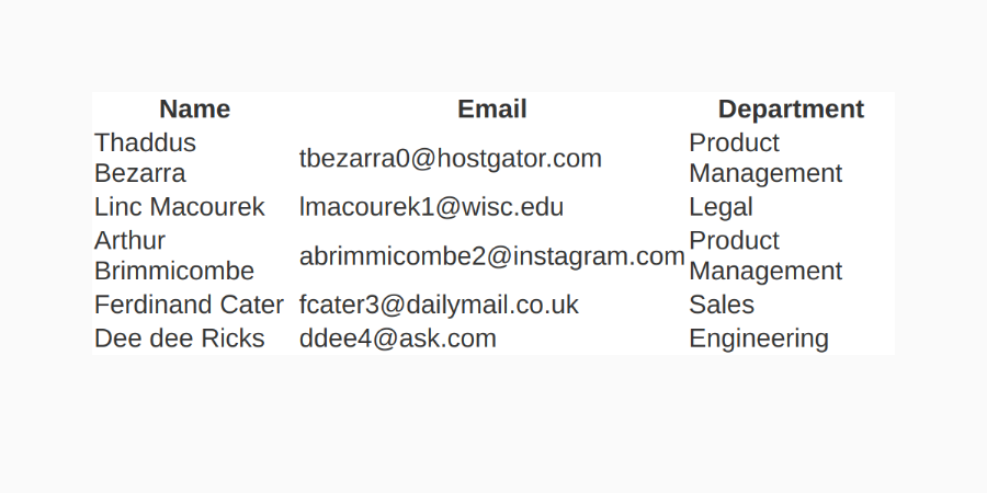
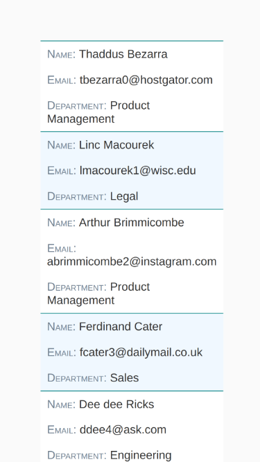
Rows
Now that we have the cells and headers figured out, we are going to turn our attention to the rows. Currently there is no visual differentiation between each of the rows. So let's add some borders at the bottom of each row. We are also going to add a border on the top of the first row of the body so that the table has a border on both the top and the bottom. Once we look at the wider screen, this will also draw a separation between the header and the body.
  tr { border-bottom: solid 1px teal; }
  tbody tr:first-of-type { border-top: solid 1px teal;
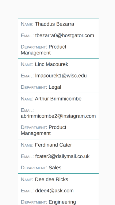
To further the separation between each row even more, let's also alternate colors every other row. To meet this end, we are going to use the nth-of-type() pseudo class passing in a value of even to add a background color to even indexed rows.
tbody tr:nth-of-type(even) { background: aliceblue; }
We now have a table that works well and looks good on mobile. So we can now approach the wider screens.
Handling wider screens
With the styles we have, we look good on mobile, but when we expand the width of our screen we need to reinstate the more standard table looks and feel with rows and columns.
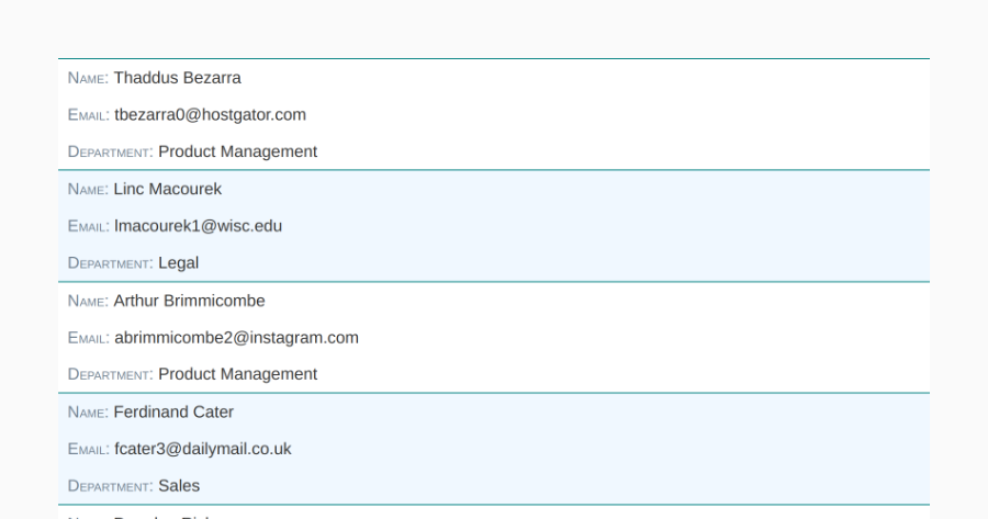
The first thing we are going to do is target wider screens using a media query. Within the media query we are going to reinstate the columns. What we want to do is revert the tables elements from having a display value of block to having their default values. Instead of applying a new value, we are going to use revert.
The revert CSS keyword reverts the cascaded value of the property from its current value to the value the property would have had if no changes had been made by the current style origin to the current element (“revert - CSS: Cascading Style Sheets | MDN”).
What revert is going to do is undo everything we did to those properties to setup our mobile layout.
  @media (min-width: 600px) {
    table, thead, tbody, tr, td, th {
      display: revert;
    }
  }
Now that the columns are reinstated, we also need to bring the header back. We are going to use the same technique we did for the columns by also giving the position property a value of revert.
  @media (min-width: 600px) {
    table, thead, tbody, tr, td, th {
      display: revert;
      position: revert;
    }
  }
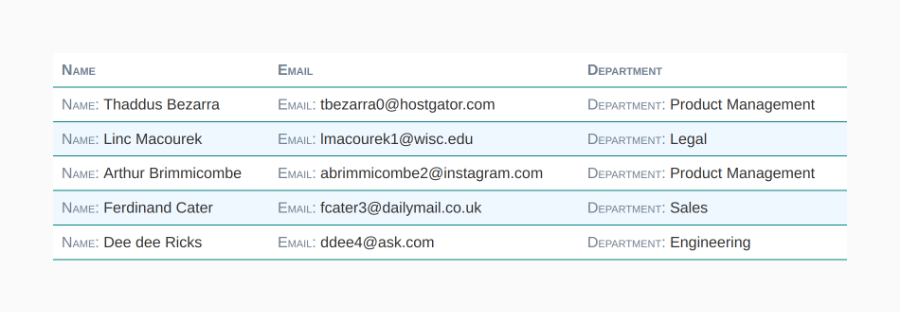
The last piece left is to remove the header information we display before each cell. Since we have the headers at the top of the table, we no longer need them on each content element. By setting an empty string value to the content property, the header information will be removed.
@media (min-width: 600px) {
  table, thead, tbody, tr, td, th { ... }
  td:before { content: ''; }
}
Closing thoughts
With just a handful lines of code we can revert the styles specific to small screens while keeping theme consistency across screen sizes.
The full code can be found both on github as a gist or you can see it at work on Codepen.
A video walking through the code is also available on YouTube: Watch video on YouTube.
Happy Coding!